Studio 8
by actiondesigner • Uploaded: May. 05 '08 - Gallerized: May. '08

Float
(Floaters:
36 )
Description:
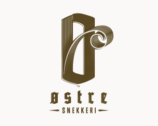
MediaProdution Company in Norway. They produce finished video products to a customers requrements. They do everything from start to finish ...brief, scripts and puts the production team together (camera staff, makeup, editing, sound tracks, visual effects. Incorporating S and 8 reflects the idea of bringing all elements of different expert areas combining them to make a perfect end product. They are also 8 people working as a perfect unit but with different expert background.
Status:
Client work
Viewed:
11099
Share:
Lets Discuss
I like it however there are quite a few concepts out there like this as I noticed with my %22Layer8%22:http://logopond.com/gallery/detail/18968 project that I did.
ReplyI keep fairly good track of these things. Just experimenting and liked the way it turned out. I like the way it plays with my eyes. S or 8. Hoped that the concept would validate the execution. Thanks for making me aware bart:) Very solid showcase you have btw
ReplyI like this one the best. It's the most memorable.
ReplyI like this the best too
Replythis is superior to bartodells
ReplyNice mark.
Replylove it!
Replylike it... i have to agree with bartodell, there are a lot of marks similar out there,but, i like this :) kinda retro feel, like an 80's tv station logo
ReplyI like the other one better.
ReplyThis mark is surely an inspiration for starters like me. Great :)
ReplyWell done. I think you've executed very well on this.
ReplyThank you very much. **@bai*Nice to know that my work can be inspiring sometimes:) Also, I think you will find a lot of inspiring work on this site. Good luck
ReplyHey action, have you seen this one yet? Just an FYI.*http://logopond.com/gallery/detail/26647
Reply@ocularInk*No ...I haven%B4t. And I really dont get your FYI. Im trying to incorporate 8 and S which is why I ended up with this execution, among others. Not to sound cocky, its not my thing - but I think this works better for what Im trying to communicate. As others have pointed out, there are executions out there that is somewhat similar to this look. My execution is done in this mannor because S and 8 have both circular shapes in common. Imagine if I should compare every logo made up of dots, 3d, negative space or god knows what. I would spend a lot of time adding a FYI. But I appreciate your heads up. I dont think you thouht I was ripping of a logo, just making me aware that there is an S mark made up of circles of different colours. I thought initially that someone was ripping of my logo:) That wasn't the case though:) You are an active member of this community and I really happy with all your valuable feedback. And I really mean EVERY feedback:)
ReplyExcelente
ReplyI like the way you put together S and 8... Great clean design too... good job!
Replynice emblem%3B but wld like to see it with another font..
ReplySolid mark. I'd tighten up the word spacing, then it's there.
ReplyThanks once more:)**@illusio*Fixed:) must have uploaded a version with sloppy kerning. Thanks
Replyyou have some already classic logos in your showcase. nice work!
Replyamazing symbol -
ReplyPlease login/signup to make a comment, registration is easy