Coast
by webbous • Uploaded: Apr. 22 '08 - Gallerized: Apr. '08
Description:
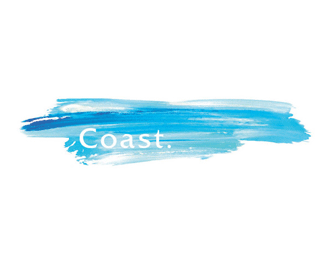
Logo for a ladies swim and leisure store based in Sydney.
Status:
Nothing set
Viewed:
13865
Share:






Lets Discuss
I like the mark but not 100%25 sure about the font or text placement. Don't get me wrong...it might be the best solution sitting where it's at. But what would it look like above and to the right side. When I think of coast I think of a horizon line. The text above might reinforce that. Just a thought. I'd love to see some layout options.
ReplyVery nice... I love it.*Honestly it'll probably be a pain to implement on many circumstances, but I just adore it. Very fresh, a lot of texture... awesome.
ReplyThe streak is great. But my first thought was the type may get lost when the logo is small.
Replywow....that is absolutely brilliant! well done!
ReplyDo you actually need the dot after Coast? It's not a sentence but a logo, I assume :D
ReplyI think the whole thing works (including the dot). Provides that subtle bit of impact to an altogether calming logo.**Great stuff!
Replyyep, I agree with gthobbs that it not 100%25 sure but I like it ! Some different layout options are the good way for you to make it better !
ReplySome different layout options are the good way for you to make it better !
ReplyI agree that the text needs some work - I dislike the period. Maybe bolding it up? The streak is fantastic though!
ReplyThe font size/placement can make it have a more impact. Otherwise the colous are just great.
Replyen fotocopia no se va a identificar la marca*
ReplyI love it. It is brilliant and atypical. It breaks a lot of rules, but for good reason.
ReplyI think i agree about the font choice, but i'm a big fan of .'s on logos. I'd maybe look for a font that's a little plainer and heavier.**Maybe if the blue was slightly darker it would show the negative text a little more.**Maybe even knocking out the center of the o would make a bit more impact too, so it looks more like a dot..?
ReplyI love this! I've seen it so many places, too. I kne wit was on the pond somewhere...
ReplyPlease login/signup to make a comment, registration is easy