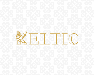
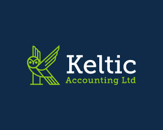
Description:
A logo made for a small accountancy business. An owl makes the shape of the K letter.
Status:
Unused proposal Viewed:
3708
Tags:
outline
•
green
•
gold
•
owl Share:
@hamza92 Thank you very much for your answer, highly appreciated. I don't want that somebody think I am "stealing" work an infringe a mark. I have some desings waiting for a while to upload, but not quite ready. For the lion I had also the idea to use only lines and in a version I added serifs, but did't look good, in comparison to your owl which looks great. I will let you know, when I upload my design so you can have a look. Cheers!

Lets Discuss
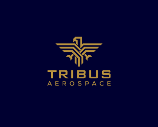
I designed a winged lion a few weeks ago like in the shape of a K without any awareness of your owl. Do you mind if I upload it?
Reply@AndreasZaugg Not at all, I would love to see it :D
Reply@hamza92 Thank you very much for your answer, highly appreciated. I don't want that somebody think I am "stealing" work an infringe a mark. I have some desings waiting for a while to upload, but not quite ready. For the lion I had also the idea to use only lines and in a version I added serifs, but did't look good, in comparison to your owl which looks great. I will let you know, when I upload my design so you can have a look. Cheers!
Reply@hamza92 Hi Hamza, I wanted to show you this for a longer time. Well, very busy at the moment, school, job, family. anyways you can have a look at my version. The idea was to basically show clean lines and shapes: https://logopond.com/AndreasZaugg/admin/logos/update/196231/?update_id=277560
ReplyPlease login/signup to make a comment, registration is easy