Opus Consulting v2
by actiondesigner • Uploaded: Feb. 23 '08 - Gallerized: Feb. '08

Float
(Floaters:
17 )
Description:
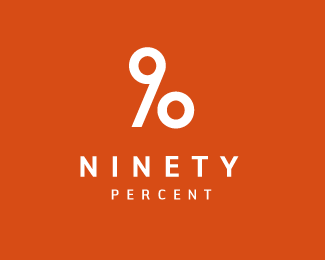
Logo for a consultant and reqruitment agency specialising in the finance and economic market.
The O/ marks is also used standalone but enhances the concept when added to OPUS
Status:
Client work
Viewed:
7045
Share:

Lets Discuss
I did some changes from the previous version (http://logopond.com/gallery/detail/24975) Since the changes where so great I postet a new one. I still like the other approach but with some conserns. Still undecided. I like the typetreatment better here. More distinct ...more serious. The other execution is obviously not possible with this type. The O/ will still work as a mark on its own.
ReplyIt is nice that the 'OPUS' comes across quicker on this version. They're both nice.
ReplyWOW, great concept, looked at both go with this one. I would experiment with different type and color but you nailed a GREAT concept here.
ReplyThanks%3B-)**I was actually very pleased with the type, The colour could turn out blue in the end though. Any thoughts on the type.
ReplyI guess types ok, but don't relish color, My personal taste would have opted for a more rounded type to really nail the percent aspect. But this is todays style of type I guess, so guess it's just taste.
ReplyGood point on the type. I initially used a round type to emphasize the percent - as you said. I still felt that the custom type was a bit generic. I also felt that percent is percent no matter the typeface. **I hate relish!!!:-) It turned out wrong in this version. Its the colour from the old version which I was aiming for. So if the old version turns out relish on your screen - let me know
ReplyI concur about the percent thing. This logo is actually good enough in Black and white %3D CONCEPT color is irrelevant really.
ReplyI like this alot.
ReplyI think the concept is good, but for me this just doesn't work visually yet. The balance seems really off with a large portion of the logo in halftone.
Reply@ mister jones.*Thanks. Remembered some of your logos from Tres Logos, when you uploaded them here. And thats a good thing right:) Had some stuff in there myself. Did you upload any good to Los Logos 4?**@cfig*Thanks for your comment. I think it works well though. Value your feedback.*Would you say that %22this works better then?%22:http://www.actiondesigner.com/opus.jpg *
ReplyBrilliant! Very well done. It's communicates very effectively, very simply.
ReplyI'm not too sure of you guys, but i don't think this works for me. i mean for starters you've picked the right font for the logo, however i think you should lose the percentage sign though. This logo looks a 'lil lop sided, unbalanced and 'hanging' if you like. Perhaps you could break away the percentage sign from the company name and make it sit in a rounded box and place it right after or beside the company name? It's just my take on the design, great attempt nevertheless actiondesigner %3B)
Replyactiondesigner: better i think, i MUCH prefer the color of that one. The balance, however, still seems really off, as mofarik said it's kind of lopsided. Have you looked at creating the percent symbol using the o and the p? You've got all the elements there, just a matter of making it work visually and it'd leave you a much more balanced mark. I think this could be really good, you just need to explore some more ideas with it.
ReplyHello actiondesigner,%0D*%0D*Speaking for myself and not necessarily your client, I'm not sure that a percent sign that's tied in with the %22o%22 is a terribly communicative visual concept. Plus the challenge of keeping it from looking like %25 of pus isn't worth the payoff if you pull it off. Sure, you *could* make the S a dollar sign and a lot of other such tie-ins that vaguely relate to finance, but...%0D*%0D*It might be a case to go back to the client and understand why they called the business %22Opus consulting%22 in the first place. You could perhaps draw upon different visual allusions and psychological associations, such as to music? Maybe evoke a strong feeling of grand financial symphony they have orchestrated... as opposed to %22we use percent signs in our day to day work%22. :)%0D*%0D*It would be a little bit less of an uphill battle for it to look %22financial%22 if you stuck to the blues/grays/greens that are common in the industry. But, again, this is up to the impression the client wishes to convey.%0D*%0D*Regards,%0D*met%26aelig%3Bducation
ReplyFirst off ...the logo ended up being white on blue. Like 99%25 of the finance market. Just wantet to take a different approach than I knew they where aiming for. The type is beautiful for the target audience. The O accompanied with / is used subtile in the design. The / is used in the layout and has many different symbolisms in the design. The O with the / is used on its own and works really well. Still the subtileness, but you get the idea without showing it.**@mofarik*Dont think I will put it in a box. The symbole is ment to break apart from it ...so you are right there. Dont think its hanging.A percentagesign looks like that. Thats the logical place to put it. BUT ...I think that maybe %22consulting%22 is what make this unbalanced. Just doing a single unorthodox simple add to the original logo. Thanks for your comment**@cfig*dont know if you and mofarik are talking about the same design if you are refering to the link I posted. And you surely must have %22seen this%22:http://logopond.com/gallery/detail/24975. Its why I posted this in the first place**Then you can also check out **www.actiondesigner.com/opus2.jpg** and **http//www.actiondesigner.com/opus3.jpg****@metaeducation*the dollarsign is a typical %22on top of my head%22 thinking that is discarted instantly. Keep in mind that this is for the norwegian market also. Opus can relate to architecture and music, means gods work ...and cant really be linked to what they do. Just a short easy to remember word. They are small and dont want to be grand. And the execution is all about subtilnes. I just wanted to add something. For instance ...the O with the / on its own says it all in a simple way. I just like how this enhances the concept just complimenting the set logo/type. Its a good way to integrate a mark that also works on its own. That is why I think this is good. And blue is used.**But ...I really appreciate the feedback guys. You spent much time giving me your well thoughtout thoughts on this.
Reply@cfig**I'm talking about the current one here.**@actiondesigner*I would suggest to explore on other areas to create an icon for opus consulting. Exploring the word Opus %3Ca href%3D%22http://en.wikipedia.org/wiki/Opus%22 target%3D%22_blank%22%3Ehere%3C/a%3E I think this could help you spark some ideas. Try to tear yourself away from the normal %22%25, %24%22. Free yourself is my advice %3D) Go go go!
Replymofarik, i'm with you, was agreeing with your observation.
ReplyPlease login/signup to make a comment, registration is easy