I also was hinted to the %22Creative Latitude%22:http://www.creativelatitude.com/ mark as well. It is very well known and has an established appeal to the design community.
gt, you sound defensive - you shouldn't. It doesn't help. It IS similar but it doesn't mean you copied it. It is very hard to come up with something totally original when there are so many logos today and many of us see this sort of comparison with our work. I prefer yours.*
I was going for type that looks clean, simple, understated, sterile, generic, stable and, one might even say %22industrial%22 to counter the more creative flair of the wisdom mark. Perhaps I did not succeed.


Lets Discuss
Not close at all.
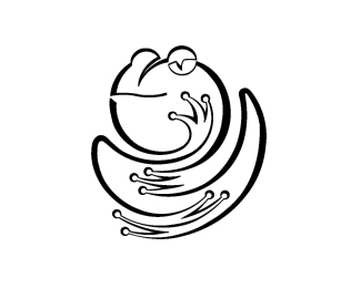
Reply/me likes it. very abstract.
ReplyMy reply wasn't intended to be defensive. Just my thought on your thought.
ReplyI also was hinted to the %22Creative Latitude%22:http://www.creativelatitude.com/ mark as well. It is very well known and has an established appeal to the design community.
Replygt, you sound defensive - you shouldn't. It doesn't help. It IS similar but it doesn't mean you copied it. It is very hard to come up with something totally original when there are so many logos today and many of us see this sort of comparison with our work. I prefer yours.*
ReplyMy reply wasn't intended to be defensive. Next time I'll add an emoticon :-)**
ReplyTotally agree. I love comments. Bring 'em on.
ReplyI was going for type that looks clean, simple, understated, sterile, generic, stable and, one might even say %22industrial%22 to counter the more creative flair of the wisdom mark. Perhaps I did not succeed.
ReplyWas this in Rockport's %22letterhead and logo design 8%22? I like this a lot.
ReplyIt's been in a couple of pubs but I can't remember for sure which. This is a few years old.
ReplyPlease login/signup to make a comment, registration is easy