PureRein
by JakubSudra • Uploaded: Apr. 26 '16

Float
(Floaters:
0 )
Description:
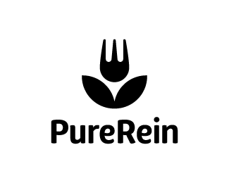
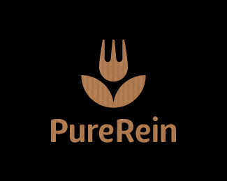
PureRein is a producer and distributor of healthy food Its founder, valuing the work of designers, like Polish logo design legend – Karol Śliwka – wished for a classically simple logomark.
The created graphic combines symbols of a fork and a flower, representing food, nature and happiness. The fitting font is rounded, organic-like.
Working with the Purerein brand consisted also of designing an extensive series of packaging with hand drawn illustrations of plants associated with the products.
As seen on:
PureRein
Status:
Client work
Viewed:
1143
Tags:
simple
•
nature
•
flower
•
eat
Share:

Lets Discuss
Please login/signup to make a comment, registration is easy