KAMP Hawaii - unused01
by atomicvibe • Uploaded: Oct. 28 '15 - Gallerized: Oct. '15


Float
(Floaters:
40 )
Description:
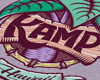
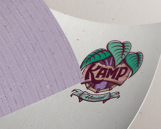
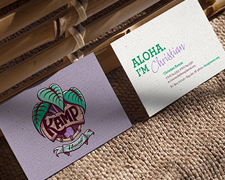
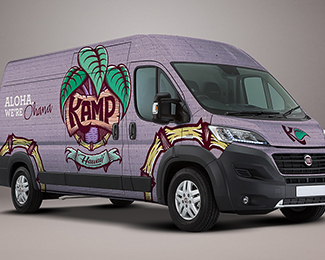
KAMP Hawaii, which stands for Kids At-risk Mentoring Program, is a Hawaiian-based nonprofit youth mentoring program. The logo depicts a Kalo plant, which is the origination of the Hawaiian creation mythology. See my website for the full branding presentation: http://www.atomicvibe.com/work/#/kamp/
As seen on:
atomicvibe
Status:
Unused proposal
Viewed:
16198
Tags:
seal
•
crest
•
lettering
•
leaves
Share:


Lets Discuss
Great Stuff.
Reply^Thanks, Mike.
ReplyLove your style bro!!
Reply^Thanks, Alan. You know I love yours!
ReplyThat really took a great amount of time to complete, but itw worth it.
ReplyGreat Work
Thank you for your kind words, Bujar.
ReplyThanks for the gallery spot. Much appreciated :)
ReplyYeah...startin to hate you abit now.
Reply@chanpion Heh, I love you too, Normy! While I feel this one is very pretty, and I love the amount of detail and craft I put into it, and I appreciate that it ended up in the gallery, I have to admit, the creative direction the client chose - which sits in my profile, unseen and dead to the world (since most people no longer look at anything on here unless it's in the gallery) - is a much more thoughtful, meaningful, and emotionally resonating solution, and was the obviously perfect choice for this particular client.
ReplyI agree with you there bud. While this one is pretty and all, the final version (loving all your collateral work btw) was much more versatile in terms of branding. The Kalo leaves in this one is slightly too dominant and is overpowering the other elements of the logo. And although the 'woodwork' in the middle is just amazing, the K descender looks a little awkward. All great elements but just fighting with each other a bit. If I had the power to edit the gallery, I would most likely went with your final version as its more balanced and the added 'icon within an icon' (the K for KAMP Kids) I thought was quite brill. Hats off my friend.
ReplyPlease login/signup to make a comment, registration is easy