voodoo
by nido • Uploaded: Jan. 23 '08 - Gallerized: Jan. '08

Float
(Floaters:
49 )
Description:
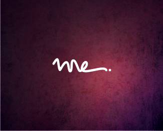
for a beautician/fashion designer...
As seen on:
voodoo
Status:
Client work
Viewed:
11291
Share:


Lets Discuss
first I saw it in the gallery, it looks normal. But, something tells me it's not the one. So I decide to see the actual size of the work, how wonder It's Nido's.%0D*%0D*You have the dare to do experimental.%0D*%0D*I like this work nido...%0D*%0D*you cut down the cliche of the thinking.
ReplyColors seem spot on. I also really like the weight of the type. If it holds up in Print, then I'd say it works. However, in regards to originality, this one doesn't have the wow factor as some of your other logos. Even so, it's neato.
ReplyI'm all for straight-up set type logos, but I think they need to be used sparingly...This logo is for a beautician, a person who strives to compliment/enhance natural beauty, which is exactly what this logo does.**Gold Nav, Gold :)
ReplyHmm, interesting thought Hayes.
ReplyNido the only thing I could say that could set this off is if you matched the shape of the V to the same as the rest of the letters. This way the type retains the same shape throughout. Love the simplicity in this one man.
ReplyThank you everyone.. im glad to have received such a 'mature' response to this.. from some very 'mature' designers... it could very easily have been ''and???...'' **Thanks again guys
ReplyHEHEHE!!! You always make me laugh Nido when i need it the most! Rock on bro!
ReplyTremendous my friend! Very hypnotic type!*%22Sometimes I dream... That he is me... Sometimes I deam... I wanna be like Nido%22
ReplyClever and clean word mark bud. Mate, THIS is nido.
ReplyI don't have the balls or confidence to pull one of these off yet. This works very well, nido.*I want to have your babies.
Replyhold on climax!... it is friday night!!!.. %3B)*
ReplyAnd nido is feeling FRISKY!!
ReplyUh oh...now I'm scared.
Replymmm i like the concept, but i feel is a little thin.
Replyif you turn it upside down it reads oopoo%5E . Fail.
Reply...and flip that, it reads %5Eooqoo... this logo works on so many levels!...
Replyflip it one more time and you get**%5E*o*o*d*o*o
Reply..genius!
Replychange the d in front and you get doodoo.*
Replyflip those d's and you get poopoo
Reply%3Ci%3E%22Nido the only thing I could say that could set this off is if you matched the shape of the V to the same as the rest of the letters. This way the type retains the same shape throughout. Love the simplicity in this one man.%22%3C/i%3E*Wouldn't that make it into a U?*I like super skinny sans serifs. Tasty!
Replyclean, simple and light, i liked
Replynice one but i think only font style is used anyway nice mat like it
ReplyI think if you had been off in color or value...or the weight of the stroke, this would not have worked...which makes it a real tightrope act. Great work!
Replyits really neat in all its simplicity ... might have some real issues if it was be used in smaller sizes, but i recon youd just have a secondary form for small sizes.
Replysimply love this one!
ReplyThank you everyone.. im glad to have received such a 'mature' response to this.. from some very 'mature' designers... it could very easily have been ''and???...*well GEEZ let us know first. then we can be mature.
Replyand???**:%3E
ReplyV Nice
Replythat voodoo that you do so well
Replylol... thanks guys...
Replyvoodoo! nidoo!!
ReplyThanks Nav, made my job that much harder :)
Reply@logomotive... what wont kill you... %3B)
Replychange "v" to o and kill "d" then replace it with o, then we got, ....oooooo...
ReplyLOL
Please login/signup to make a comment, registration is easy