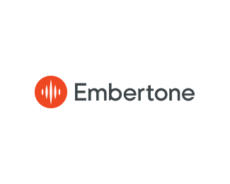
Embertone
by OcularInk • Uploaded: Dec. 12 '14 - Gallerized: Dec. '14

Float
(Floaters:
30 )
Description:
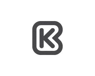
Embertone's mission is simple: Sample lots of great instruments, and bring them to you to inspire awesome new music. They love to find new ways to capture the essence of an instrument, and to program it in an intuitive and responsive package.
There old logo had run out of life (you can see it at Embertone.com) and Embertone wanted a new look – one that would bring them into today's market.
The mark combines the essence of a flame merged with a music wave. The wordmark is custom. The subtle points on certain letters tie back in with the sharp points found in the mark.
As seen on:
Ocularink.com
Status:
Client work
Viewed:
10345
Tags:
circle
•
ember
•
wave
•
music
Share:


Lets Discuss
Great work, Kevin!
ReplyI like this Kevin. Well done.
ReplyCleaned to the bone.
ReplyNice work. Love the wordmark.
ReplyNice mark Doc!
ReplyThanks old friends.
ReplyJust checked out the old logo and "run out of life" is an understatement. "Stillborn" came to mind.
ReplyThe update, however, deserves all the praise it gets. Simple, strong, clean and professional. Not to mention admirably put together. Well done on this.
Effective clean custom type and icon that compliments each other. Yes that old version that was born the same year as me needs to go. Nice work Doc!
ReplyHaha, thanks dudes. It's so nice to receive such praise from some of the best logo designers I know.
ReplySuper clean man. Good one!
ReplyThanks, Anthony!
ReplyVery clean.
ReplyPlease login/signup to make a comment, registration is easy