Sanetto
by rohanjacob • Uploaded: Jul. 08 '14


Float
(Floaters:
2 )
Description:
Full Project : https://www.behance.net/gallery/18478027/Sanetto-Digital-Agency
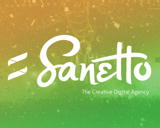
The logo is created in a way that it underlines what the company does and how it does.
Its made keeping in mind of the signature that would be valued high.
Its easy on the eye and makes one fall in love because of its cursiveness and the
application. The ‘S’ connected to the ‘a’ and the ‘e’ made out of love (heart) giving the little caps
in the group of small letters. The ‘t’s’ which are unconventional and their cut line leading into
the little opening of ‘o’ makes the logo in one fluidic motion.
The icon is purely for marketing which is an equal sign, an abstract made out of the initial ‘S’.
This will open up to amazing possibilities for marketing the brand.
As seen on:
Sanetto
Status:
Client work
Viewed:
1205
Tags:
white
•
black
•
b/w
•
triangles
Share:


Lets Discuss
Please login/signup to make a comment, registration is easy