Rock Fuel
by kattttor • Uploaded: Dec. 15 '07 - Gallerized: Dec. '07

Description:
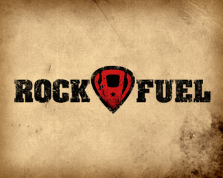
This is for a up and coming rock band called Rock Fuel.
You can listen to their music at http://www.myspace.com/rockfuel
As seen on:
Rock Fuel
Status:
Client work
Viewed:
17290
Share:


Lets Discuss
I love the mark. I see you reached a final? Guitar pick fuel pump, very clever nice work.
ReplyThanks, yep this is the final version. Made some minor changes, redid the star and the dust/dirt. Played a little with the text but didn't come up with anything that looked better then this. **Overall I'm very happy with it.
ReplyI like the pick/pump the mark and it works well breaking the type. The distressed type is well executed too.
Replygreat logo, but why the background? Shouldn't a logo stand on its own on a white background? Never understood that.
ReplyIt can be noticed that if a logo has a colored background with effects it has more than 30%25 chance of entering the gallery, so why not?
Reply@ MikePearce : In my opinion, this logo would work just as well on a white background. The idea is clever and nicely put together. However, I do agree with you. A logo should be able to stand on its own on a white background.
ReplyAny decent designer can look at this and see that it will work just as well on a %22white%22 background as it does here, In fact any decent designer can look at a well designed logo on a dark background and figure out how it can be reversed and work just as well. There is not a set standard on the way a logo should presented, the standard is that it should work both ways. While it is true that most printed published works of logos are on white, this is the internet and we are dealing with translucent light, so why not get the most out of a presentation, to each their own.
Replyhttp://petergranfors.com/clients/rockfuel/tshirt/rockfuel_colorversions.jpg**The background is from the cd cover that I made for the bands demo, I like it so I used it here as well.
ReplyNice. It even looks better on a white background IMO. The red really pops then. :-D
Replyvery cool. though i realize what it is from the discussion, at first look i thought %22rocket fuel%22 I find the mark a little hard to get that it's a pump...it's still a good one, nonetheless
Replyhow bout using a guitar instead of a pick? using a shape which is a mixture of guitar and fuel nozzles,, nozzles comin out on sides of main body of guitar,, u understood? or shall i send a rough sketch?
ReplyNo need for a white background. This looks awesome!
ReplyPlease login/signup to make a comment, registration is easy