Cocoa Lounge
by HelloUriah • Uploaded: Nov. 21 '07 - Gallerized: Nov. '07
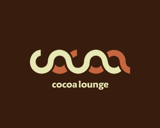
Description:
Small, soon to open lounge / cafe / library / everything.
[edit] After working with the client more.
Status:
Nothing set
Viewed:
9890
Share:


Lets Discuss
Nice. How would it look if the white line was the same thickness as the brown line%3B Then extended to replace the rectangle shape?
ReplyThanks Firebrand, it flows a lot better now.
ReplyI love this. But I feel the type is almost distracting from the word-mark above.
ReplyWOW! Great concept my firend, thumbs up for this one for sure! %3D)
ReplyI really like this one!*Unusual %26 distinctive.*I think it needs the type, (just like it is) it would be hard to read without it.
ReplyNice idea but it does not quite work for me because the second %220' reads like an a. perhaps you could work on overlaps to prevent this? Way to think about it though.
Replymaybe its just me but its not readable at all, two snakes embracing :)
Replyshow!!!
ReplyThe type could be better... but the symbol rocks!!!
ReplyI like this a lot. But it is a bit hard to make out.
ReplyCongrats on making it to the gallery!
Replymakes me wanna drink some cocoa right now... in a 'loungy' atmosphere. great logo.
Replylove it
ReplyVery clever :)
Replygreat!!!!
ReplyProblems reading the O's... if I did'nt knew what it shall mean i would read...cauaa. You've chosen/created a font with a nearly circular counters. the downfalling sides of the O's destroy the circle, so it gets the look of an a and makes it hardly readable.**iLike though.
ReplyPlease login/signup to make a comment, registration is easy