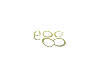
Kailia
by nido • Uploaded: Nov. 11 '07 - Gallerized: Nov. '07

Float
(Floaters:
49 )
Description:
final version...
As seen on:
kailia
Status:
Nothing set
Viewed:
11865
Share:


Lets Discuss
Nicely refined, nido.
ReplyDude this is a RIP..%0D*http://logopond.com/gallery/detail/18568%0D*%0D*
Replythank you mate.
ReplyLOL... ok.. first off the thanks was to Roy.. secondly.. how can you compare the two!.. seahorses cant curl their tails backwards.. that dudes an amateur!
ReplyOk ya got me :-)
Replytold ya son.. one bullet %3B)
ReplySuperb! I like it cause its cleaner then the other version.
ReplyLOL!... make it a double!
Reply...%26 how dare you think i would RIP! %3B)
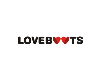
ReplyLove the negative heart shape! beautiful!
Replyvery excellent
Replywell refined!
ReplyWell done bud. The double hearts are a bonus! Cheers.
ReplyHi, posted this design on my site for 04 Feb. Meanwhile, have posted another of your design here.*http://cluelessclay.com/blog/2007/12/03/love-heart-design-bombay-delight-by-fellow-designer/
ReplyI like this :)
Replythanks for the kind words people....
Replyseahorse..! i like!
Replynever saw this before, i like it's beautiful nido!
ReplyYeah, what I love about your work is the character you can pull off in whimsical ways.
Replythanks guys...**@Mike.. that's one of the things I really love about me too... is that like.. canny.. or what!!!
Replymissed this....way cool
ReplyThis logo is beautiful and tender.
ReplyI could imagine this mark when it\'s on the white space...hmmm....nice one buddy!
Reply^ This kind of copypasta doesn\'t really work on a logo that already has a white background. Just saying.
ReplyPlease login/signup to make a comment, registration is easy