SRIRAM
by JuliusSeniunas • Uploaded: Feb. 11 '13

Float
(Floaters:
8 )
Description:
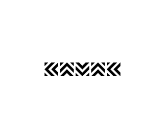
Luxurious design brand.
Whole typeface made from 3 shapes.
Status:
Client work
Viewed:
3487
Tags:
wordmark
•
symbol
•
sriram
•
letters
Share:
Lets Discuss
M and A are brilliant.. R is also cool.. not sure about I and, especially S - it seems that there`s space for some improvement, IMO..
ReplyHey, yea have been working a lot on those. S is intended to commemorate the shape of the snake, that it is why it is without the serif ;)
Replyalso the main priority was to create type using just 3 shapes ;)
ReplyI think it looks awesome except that for me A and M needs more work than anything else.
ReplyPlease login/signup to make a comment, registration is easy