Anoma
by HayesImage • Uploaded: Jan. 14 '13 - Gallerized: Apr. '13

Float
(Floaters:
36 )
Description:
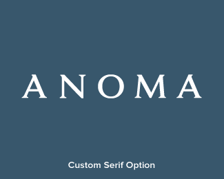
Anoma, a formal fashionwear startup based in Northern UK, the name is actually an amalgamation the two founders; Anna & Norman.
Status:
Client work
Viewed:
7001
Tags:
Swash
•
Script
•
Clothing
•
England
Share:


Lets Discuss
Is it just me or is the M leaning a little too far forward, in contrast to the O & A?
Replymaybe just a little bit (but not much). also, have you tried bumping up the \'m\' and \'a\' a few clicks? really like how this one turned out, josh.
ReplyJosh, I think 'noma looks good, A needs some work?
ReplyThanks for input guys, it\'s certainly not \'there\' yet :)
Reply@Colin; bump up as in size, weight or position?
@Mike; A bit busy is it?
position, sorry. as for the \'A\' i would like to see it without that swash going out to the left. not that it\'s a bad thing at all, just would like to see how it works with a simpler solution. perhaps the \'An\' crossbar could finish out to the left instead?these are all thoughts, josh...feel free to ignore because i really do like what you\'ve done here.
ReplyYeah I think so, keep going back to the A, maybe the right side needs more lean to it??
ReplyThanks guys!!!
Reply@Colin - All good, just clarifying :) I definitley agree that this can be streamlined/simplified further.
@Mike Angles clashing :)
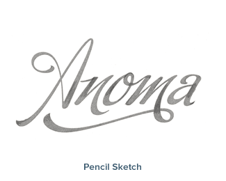
the hand sketch looks better than the white on blue :D
Replywhat is the original typography?
ReplyBuffetScript ;) alternates A and a are in the glyphs
Replyhttp://sudtipos.com/fonts/27
lol non mais toi tu les connais vraiment toutes par coeur ;)
Replybise
A hand sketch doesn't scale as well :D
ReplyThanks peeps :) And yes, the working template was Buffet Script, the biggest difference is the treatment of the N.
I actually always prefered the serif option, as in my opinion it was better for longevity...but c'est la vie :)
'A hand sketch doesn't scale as well :D' hahah yeah i know but if you could vectorized it :D
ReplyJust wait till when this becomes science fact; http://i-cdn.apartmenttherapy.com/uimages/at/ChrisPerez/tony_stark_interactive_3d_hologram.jpg
ReplyPlease login/signup to make a comment, registration is easy