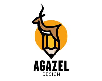
agazel
by djredsky • Uploaded: Dec. 16 '12 - Gallerized: Dec. '12

Float
(Floaters:
108 )
Description:
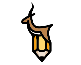
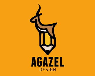
I changer the font and relative size of the name.
logo for agazel.com my new design and communication agency.
Let me know what you think of the name 'agazel'.
As seen on:
agazel.com
Status:
Work in progress
Viewed:
14738
Tags:
pencil
•
design
•
deer
•
gazelle
Share:

Lets Discuss
cool idea!
ReplyReally cool!!
ReplyGreat work!!
ReplyLove the lines of the gazelle.
ReplyThank you guys!!!
ReplyNicely done!
ReplySo awesome. I love it!
ReplyThis rocks man!
ReplyLoved it
ReplyI like it :)
ReplyVery clever
ReplyReally nice forms. With such a great mark, I think you could downplay the type treatment some. If you keep this type, perhaps add a little more spacing between the two words.
Replywow! great work!
ReplyThank you all for your lovely comments! and I did take your advice Kevin; I think it does look better now.
ReplyClever,nice..beautiful and simple
ReplyI think the pen is actually redundant. Gazelle on its self looks awesome!
Reply^ tend to agree Rokac.
ReplyIf I lose the pencil, I\'ll lose the clever part. I had sketched many gazelles before I settled on this one be cause I could make a pencil out of the legs. and now it\'s hard for me to \"amputate\" the Pencil :).
ReplyBut I\'ll give it a try. thank you guys for the comments!
Replygreat shape!
ReplyLove the design, very nice work
ReplyWow...just wow.
ReplyI think the combination is what makes this mark unique. You should keep the pencil, imo.
ReplyImpressive!!
ReplyDope stuff mate.
ReplyAmazing!
Replyone of the best logos I've ever seen
ReplyPlease login/signup to make a comment, registration is easy