weathersphere V2
by Logomotive • Uploaded: Dec. 15 '12 - Gallerized: Dec. '12


Float
(Floaters:
76 )
Description:
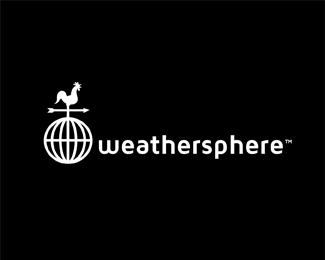
Another concept provided for Weathersphere.
Status:
Work in progress
Viewed:
14818
Tags:
Storm
•
Rain
•
Sun
•
APP
Share:


Lets Discuss
This concept is better. Cool move with opposite drops.
ReplyThanks Jovan. Client thinks so too :)
ReplyI like this one better as well.
ReplyThanks Bram, I think this one is better for client, however I really liked the simplicity in the other.
ReplyThis is killer Mike, I like how the sun rays are flipped to make rain drops...great touch.
ReplyThe other said weathersphere more to me than this, but both are wonderful.
Replythis version looks clean and fresh, I love the way you treat the beam, it is brilliant man! On the top just the opposite of the drop. GREAT!
Replyclever!
ReplyThanks friends.
ReplyOk question. Clients concern was a 32/32 size holding up. I think it is definitely recognizable. What do you all think? Client thought about eliminated the rays. I'm against that. See the variation.
Replythe rays are what make this thing special. i would try to steer your client back on track.
ReplyAgree with Colin and you Mike. I think it needs the rays. holds fine, in fact it says sun instantly and with the colors showing warm/cool and Dry(warm red) and wet (blue)it makes more sense. So you get all the elements with this. Without the rays and drops it really loses something over all I think.
ReplyHope you can talk them back.
I agree with the guys above ^^ The mark is still distinguishable at a minimum size. And for me, the \"ray drops\" give it the memorability factor. Good Luck with your negotiations!
ReplyThanks for your input guys. It gets tougher and tougher with all these minimal apps out there.
Reply^ Yup I 3rd it. The rays add the fundamental context to the mark, without them you loose the sun reference. Might be clearer to have an alternate without gradients for the smaller applications though :)
Reply^ well said. good idea,...Of course I will supply that.
ReplyHuge loss for them if they decide not to go with it.
ReplyAnother vote to keep the rays. If you are concerned about the small size I think the rays/drops could go a bit bigger or wider/shorter. Like I said elsewhere, this is an awesome concept!
ReplyI think it holds up great at 32x32.
ReplyAlthough I can see why your client would be worried about the loss of detail on the thunder and clouds in the 32. Neither concept would work without the other. Tough call bud.
ReplyThanks again. Nice to hear from the pros. I don't find it an issue myself.
ReplyNice concept, you should definitely keep the rays. It is a simple mark which manages to communicate a lot. Spot on!
ReplyEven the Unilever logo works at very small sizes. I see no problems with this 32px version as well.
ReplyClean and colourful, sends a positive message about the company!
ReplyThanks for your comments and opinions.
Replydef works, great integration of all the elements!
ReplyThank You Florin.
Replywell they chose another ;(
ReplyMissed this one. Like the ray drops.
ReplyThanks Roy, ya win some you lose some.
Replyah, the idiots. :( this was pretty great. hopefully they chose something else you did?
ReplyTrish, No but they paid me for all my work.
ReplyI understand it, but felt my logo was stronger. http://www.weathersphere.com/
Replyi think your concept is stronger but i see why they chose the other one also. its a bit more... how you say radical .. radival may not be the right work, but its more abstract and less literal? they are both good.
Reply^ that's a good way of putting it. I agree. I just try to design in laymans terms mostly if that makes sense. I try to think of the audience foremost.
ReplyJust think of the average person looking for weather reports. I just don't feel the average person using this app can relate to the center of the earth. Maybe I'm not giving enough credit to the human.
ReplyPlease login/signup to make a comment, registration is easy