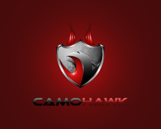
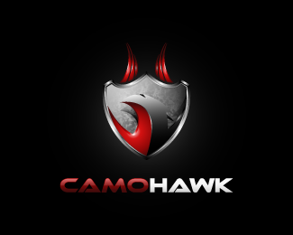
Camo Hawk
by SPARKcreative • Uploaded: Nov. 22 '12

Float
(Floaters:
1 )
Description:
A strong logo and decided, designed to service agencies in the military, navy, army. Supplies of clothing, accessories. Private companies of personal training with the provision of services to the army.
Status:
Unused proposal
Viewed:
2583
Tags:
strong
•
agencies
•
service
•
fourniture
Share:
Lets Discuss
I really like the concept and it does look strong. I think the hawk in the shield gets lost in the background of the shield. I like the detail and how it looks shiny and the camo in the background, but maybe trying to simplify it might be beneficial. You could also try making the hawk darker. Leave the red part alone and darken the black to gray gradient.
ReplyI love the 3D shield, but L-train is right in that the head of the hawk does get a little lost. Perhaps adding another color? A metallic blue for the right side of the hawk? The suggestion to darken the shield is a good one as well.
ReplyI would also like to add you need to lose the gradations and outlines on the text altogether. Completely unnecessary and complicates/cheapens an otherwise excellent idea and execution.
Thanks L-Train and THEArtistT. Yes, due to the extreme stylize hawk and a too much \"white\" on the head, someting is not function at all ... I need rework it a bit.
ReplyThanks ;)
Please login/signup to make a comment, registration is easy