Adaptive IV
by HayesImage • Uploaded: Oct. 17 '12 - Gallerized: Oct. '12

Float
(Floaters:
47 )
Description:
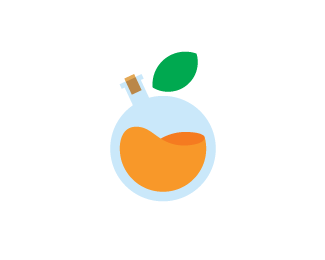
Yet another concept for Adaptive (they're all still in the pot an there's a V & VI on the way). This one deals with the nature of inducing chemical nourishment into the system. Initially I was hesitant about this concept as it can imply performance-enhancing substances, a negative connotation - especially during the Lance Armstrong controversy.
What it actually is; a focus on things like protein supplements, vitamins & other nutrients in their isolated forms - such as whey, the protein strain isolated from cow's milk that aides muscle development. The bottle is half full; therefore the fruit is still growing, when the chemical mixture is at its prime, the bottle will be full & the fruit complete.
Status:
Work in progress
Viewed:
15020
Tags:
Orange
•
Chemical
•
Nutrition
•
Lab
Share:
Lets Discuss
love the way you think, josh.
ReplyThanks Colin!!!
Reply\"When the going gets weird, the weird turn pro.\" - Hunter S. Thompson
\"you miss 100% of the shots you don\'t take - wayne gretzky\" - michael scott.
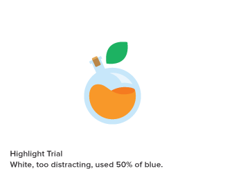
Replyokay enough of the weird stuff. on a \"professional\" note...i know you are going for a minimalist approach here, but i think a subtle highlight on the bottle would really give this a nice (fruit) punch.
Reply@Colin - Good quote.
Reply@Sam - Noted. My rationale for that is that the bottle is in centrifuge, so the high speed rotation would balance it out :)
@Colin - How spiked the punch? Sort of a faux 3d highlight...or just some clean white space? Let me ponder :)
i like this. but imo the cork is too much. feels busy with the rest of the clean and large shapes. :)
Reply@t-sovo Without a cork it\'ll make a mess ;) But I see what you\'re saying.
ReplyUpdated with type.
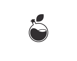
I\'ve also added a monochrome variation & a highlight trial.
Nice ...
ReplyYou\'ve done alot of work and put alot of thought into this project Josh, and it shows. This version I feel is the strongest one in terms of concept and visual. Looks great with that custom type too. Well done mate.
Replythis is it, the black and white version looks great!
Replyi like the highlight.
Reply@Edgar - Thanks :)
Reply@Norm - Thanks man!!! It\'s been epic, I\'ve nearly filled an entire sketchbook on this gig :)
@Florin - Thanks man!!! It\'s like black & white TV sci-fi :)
@Colin - Thanks! Doesn\'t create an odd focal point does it? It did in stark white, it\'s Pantone 290c @ 30%
10/10 Josh! Its perfect!
ReplyThanks man :)
Replyto me it does not. i think the tint was a good idea rather than a pure white. i think it\'s a nice touch with the shades in the liquid and cork and adds to the dimension (btw, i like the cork).
ReplyLike )
Reply@Colin - Thanks, I presented the highlighted version (along with everything else) a late last week, so i\'ll be interesting to see what they lean toward. I\'ve been pushing this & the DNA concept the hardest.
Reply@hm-himera - Thanks :)
so nice & clean
ReplyThanks John :)
Replygreat work. I\'m jealous of your skill
Replyif i had to nit pick id say get rid of gradient on the letters and the cork
Reply^ am i missing something? i don\'t see a gradient on either the letters or the cork.
ReplyThanks jaket1993 :)
ReplyDisclaimer: No gradients were used in the making of this logo.
The are 2 tones that make up the cork (the larger variation has a clearer shot of this) but they\'re not blended. The type is all the same tone of cool grey :)
sorry thought there was a gradient. im thinking now i like the cork. Adds to the message of the image
ReplyAll good Jake :)
ReplyPlease login/signup to make a comment, registration is easy