Impact Futures
by bartodell • Uploaded: Oct. 01 '12 - Gallerized: Feb. '15

Float
(Floaters:
35 )
Description:
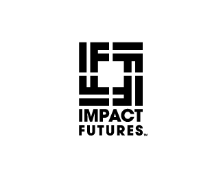
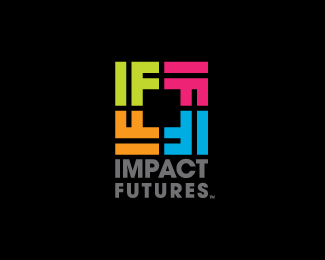
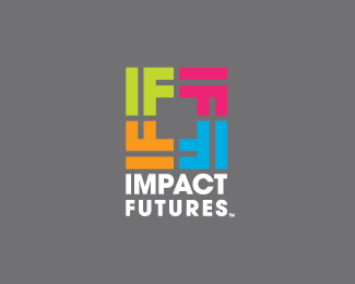
Impact Futures is committed to educating our youth and their families in a cooperative effort to prevent the occurrence of substance abuse and other high risk behaviors.
Status:
Client work
Viewed:
10259
Share:

Lets Discuss
i can see this as a tile pattern on a wall or floor, branding pieces man this has a lot of opportunities branding wise. obviously replication has been done before but it works so nicely here
ReplyDavid... you are correct. We are working as using this as a pattern in all of the advertising elements and there is actually 6 colors in the complete color palette that are going to be available for them to use. I am also developing a full branding guide as well as image visualization for them as well. This project is close to my wife's heart as well as mine and this is one of the rare 100% pro-bono projects that I have done.
ReplyAs I said before Love it.
Replythat is dope!
ReplyThanks Mike and Raja... this project is turning out to be fun!
ReplySooooo good.
ReplyGreat composition! The monochrome version works so nicely too. Brilliant!
ReplyIs it christian orientated?... just wondering if the crosses in the negative space were intentional :)
ReplyI didn't mean intentional lol... I meant was if you had that in mind when putting it together?
ReplyDurand... thank you!
ReplyChanpion... thank you!
Nido... good catch. They have core Christian values especially in it's leadership.
Very nice
ReplyThanks guys! I appreciate the kind comments!
ReplyLove your work Bart, another solid piece, flows very nicely and appreciate the subtle Christian tie-in...
ReplyThough must say it did remind me of this logo from AlexWende:
http://logopond.com/gallery/detail/130966
ouch, removed for similarities, sorry Bart but gotta dispense removals fairly.
ReplyMan I have never seen that one before. My original sketches were all over the place on this one then with a scribble the idea hit!
ReplyYeah man unfortunatly thats how it goes from time to time
ReplyCould just be me, but I vaguely see a swastika in this logo design.
ReplyLove Bart's work, but I was actually going to say the same thing about the black/white layout, it jumps out as very swastika-ish to me. I'm certain that was not the intention. I think any 'rotating' layout like this will have a similar issue.
ReplyEven here and there and everywhere, My comments gone.
ReplyPlease login/signup to make a comment, registration is easy