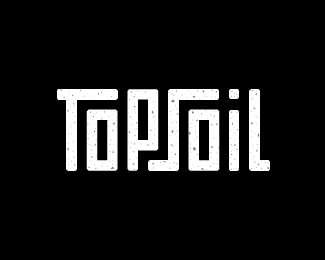
Topsoil
by SamDeMastrie • Uploaded: Aug. 09 '12

Float
(Floaters:
31 )
Description:
I'm part of a Logo Design Challenge facebook group with some school friends. The purpose is to challenge ourselves and learn to harness our creativity by designing a unique logo every day. Day 8 called for a creative design studio. This is what I came up with. I always thought "Topsoil" would make a great name. It is, after all, the best environment for growing great ideas. :)
Status:
Just for fun
Viewed:
4410
Tags:
type
•
earth
•
dirt
•
brown
Share:


Lets Discuss
Thanks for the floats everyone.
ReplyHey Sam, that's a really great sounding challenge! I mean, it needs a lot of work from you, but I think that after all there's a huge amount of experience and selfsatisfaction(if this word even exists). I would like to join it, but I think that I wouldn't stay for a long, since I made ninety-something logos this year ;)
ReplyIf you could share a link or something, that would be grateful, although I don't have a facebook.
Yeah, they're not all winners, but it's fun anyway.
Replyhttps://www.facebook.com/groups/357096711030119/
Really neat project, Sam. Looking forward to seeing all your designs.
ReplyLove the idea behind the name, and the type treatment to create such a cool word mark. I have one minor suggestion; maybe the left arm of the \'T\' could be slightly longer to match the foot of the \'L\'. Right now it looks shorter (which i think is actually an illusion.) This adjustment might add more balance to the composition. Keep up the good work!
ReplyThanks Dan. I\'m pretty sure those two pieces are the same, at least they\'re supposed to be. I\'ll admit though, the cross bar on the T looks a hair shorter.
ReplyNo worries mate!
ReplyI like it!
ReplyPlease login/signup to make a comment, registration is easy