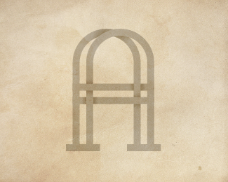
Alanson Architects
by SamDeMastrie • Uploaded: May. 24 '12


Float
(Floaters:
22 )
Description:
Exploring an old idea in my sketchbook. Would love feedback.
Status:
Work in progress
Viewed:
5395
Tags:
demastrie
•
sam
•
A
•
monogram
Share:


Lets Discuss
Perfect. Love how the A's connect
ReplyThanks Rich, appreciate it!
ReplyHow this is not in the gallery is beyond me! 2 f's.
ReplyHey, thank you.
ReplyHi Sam ... missed this one ... float and fave for Mr. genius ...
ReplyOnly because you are asking for critiques ... what do you think about the small, small space between the overlapping
pieces of your logo ...this size it works good ... but .... ??
Agree with Norman .... G !!
Thanks, and yeah, you're right--the space is a bit too thin.
Replyinstead of interlocking, I think it would look better 3D. like an arbor rather than a knot.
ReplyHmm, not sure I know exactly what you're talking about, but thanks for the input.
ReplyPlease login/signup to make a comment, registration is easy