Hanadi's Recipes
by AmeenSaqqaf • Uploaded: May. 20 '12 - Gallerized: May. '12

Float
(Floaters:
28 )
Description:
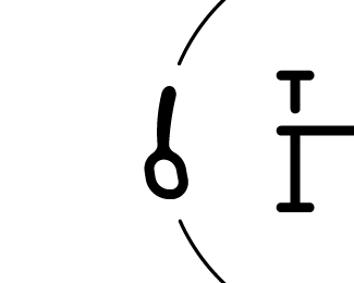
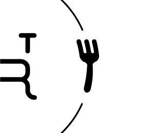
Logo concept for Hanadi's Recipes, a recipe website. Any helpful critique would be great :)
Status:
Work in progress
Viewed:
9345
Tags:
HR
•
monogram
•
spoon
•
fork
Share:
Lets Discuss
I think those four small dashes are undermining the fork and knife a little bit, because they are so similar. I would suggest a thinner line, possibly dashed that spanned the gap from the two words to the utensils. Good work though.
ReplyI appreciate the critique! I'll start working on it.
ReplyThanks! And you're right, I've uploaded way too many variations separately. My apologies if it got annoying. I'll group some of them up.
Reply@ClimaxDesigns Will do :D
ReplyI updated the logo. I changed the type, curved the fork's edges to be consistent with the spoon and lastly I changed the four small dashes that were in the gaps to thinner dashed lines in the first variation and to thiner regular lines in the second variation. Let me know what you guys think :).
I think the thinner, solid line works better. If you're looking for more critique, I think the utensils can be improved. Both are a little rudimentary: the fork looks like a pitchfork, and the spoon is simply a circle and a line. If those can be fixed, it would be greatly improved. It's getting better.
Reply^ couldn't agree more.
ReplyI agree as well and I appreciate your valuable critique sam. It's really helping a lot! I'll get back to work :D
ReplyI worked on the critique and I'm very happy with the results! The spoon doesn't look like a line with a circle at the end of it anymore and the fork doesn't look like a pitchfork. I improved the spoon and fork handles so they look more utensil like. I kept the previous version for comparison and I added two images that are zoomed in on the utensils' details. Please let me know your thoughts.
ReplyVery nice, congratulations!
ReplyAwesome! I didn't expect this to get featured :D. Thanks a lot sam for helping me refine this logo.
Reply@ClimaxDesigns Thanks!
ReplyHey! can I use this? it has my initials :) RH nice solution.
ReplyYou don't need it :P. You have a badass personal mark already!
Replygreat!!
ReplyThank you :)
ReplyPlease login/signup to make a comment, registration is easy