Millenary pictures (wip)
by baspixels • Uploaded: May. 09 '12 - Gallerized: May. '12
")
Float
(Floaters:
69 )
Description:
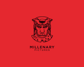
What you see above is the portrait of jaguar warrior from ancient aztec civilization in México which i was asked to design for a production company, making sense with the word "Millenary". Millenary Pictures is a elegant audiovisual production company. It is mainly dedicated to produce shortfilms, movies, internet or tv series and commercials for tv or the web. It is designed to be simple enough to be easy to identify, but also confident and heroic. The logo represents the energy found in a warrior willing to do whatever it takes to win a fight, in this case, to produce the closest, intimate and deepest movies in our country.
Your views and feedback guys :)
Status:
Work in progress
Viewed:
9421
Tags:
jaguar
•
warrior
•
soldier
•
knight
Share:

Lets Discuss
Love the detail in this Bas! Very engaging image as well.
ReplyThanks @rich i want you to feature it in logomilk as well :)
Reply^^ It already is mate ; )
ReplyThanks mate :)
ReplyIf you may excuse me here, but this is not a logo. This is an illustration. On the red version in small scale it's almost impossible to recognize any detail let alone the head. It's a good starting point, but it's way too complex for a logo.
ReplyA great example from about the theme: http://www.underconsideration.com/brandnew/archives/follow-up_indio_beer.php
Wow! Impressive logo, very strong!
Reply@Robin: I probably wouldn't go as far as to say its 'not a logo'. There are what you call 'iconic logos' or 'illustrative logos' that tries its best to differentiate between the two. Would you say the image of Kernel Sanders is not a logo? Or how about the illustration of the Twin Tailed Mermaid? While your comment on whether the mark is still legible when its reduced is reasonable, condemning it as a straight illustration is hardly fair.
ReplyAmazing! =D
Reply@Chanpion: The logos you are referring are indeed very detailed ones, however they are the perfect examples of maximally stylized forms of a picture, so the light and dark spots are in harmony, the lines (specially the intersecting ones) are avoided. The forms are not interfering with each other and easily recognizable (even at small scale). All these attributes are mandatory for a legible and quality or 'iconic' logo.
ReplyIn this case, there is a picture of a face, with a lot of unnecessary and bothering small details that are neither visible on the web or in print. These things should be cleansed before putting it out to the public as a logo, and more consideration should be taken before gallerizing a work in its current state.
Maybe it's not an illustration, but two words positioned underneath, won't make it a logo either...
wowzers, great illo.
Replyrelax robin, this is an illo and marks that push the boundary between illo and logo will eventually push us into the next realm of mark design. dont be threatened by it. the fault with marks like these are they are not easily reproduced in many contexts (like embroidery), that doesn't make them weak logos.
ReplyYeaaa!
Reply@epicantus Thanks :)
Reply@chanpion Thanks for the comment and the amazing support bud :)
Reply@natanaelewu @malicho @belc Thanks for the comment :) i really love your comments :)
Reply@robin21 thanks for the criticism, One thing i strongly believe is a brand design has no boundaries :) few years ago, when 3D logos came into trend everyone objected it saying the same print reason, but we made 3d logos. It was fun. What i say is break the rules. Think about touching people's heart. I agree with you that my design needs some revision but that does not mean the design is imperfect :) I really love your comment and that will make me step up.
Reply@ClimaxDesigns Thanks for the criticism mate. Thanks for analyzing the brand design and pointing out the keypoints of improving it :)
I really love these lines,
"The absolute perfection of any design is not the sole deciding factor as to it being celebrated as a success or inspiring design. I have numerous times - and so have the other mods - added a design to the gallery that is unfinished or could use more polish as they display a diamond in the rough or have enough other attributes that still make it inspirational. "
It really makes sense!
I actually understood that you are not criticising it badly, but you are molding it to a greater purpose. I love the way you actually taking care of my logo.
Thanks robin1 and climax design !
And @chanpion i really love your support and motivation !
ReplyThere are a multitude of reasons why this is a great 'logo'. Artistic beauty, creativity, the harmony between mark and type, works in monochrome even with all the detailing ... Also the letter M within the graphic plays on the sharp lines of the jaguars teeth and eyes (a wonderful extra touch). Keep it up Bas! This sort of design style kicks all 3d stuff to the curb!
ReplyWell said everyone and in a way, that includes you Robin. Your critique came from someone that has I sense a great passion for logo design and its basically an honest opinion of what you think a logo should be. But like Brian said, lets push the boundaries and design like there are no rules. What we learnt at design school are only guidelines for us to set our own foundations. What we build on that is totally up to us! Remember in design, there are no absolutes.
ReplyBas, a really nice piece of illustrative logo. And ya see?! I didn't pick up on the M. Well spotted Rich!
@rich @chanpion i really love you guys! I really am indebted to you :) Rich, we know each other since 2007. And you know i was a beginner in 2007 , i believe that i have improved now. All your works are like ladder to me, i have learned a lot from seeing your designs. Now i feel very happy and proud and also a bit sentimental to receive such an awesome support from my teacher. You both are always on top of my heart. Thanks for the support mate.
Reply@chanpion you are really awesome, You guys have given me a huge responsibility of designing great logos. Our understanding is so healthy. I love the way you like my design. I love your humbleness and your honest opinion on logo design. You guys are on the top of my heart. Thanks :)
So thin and amazing lines. My respect!
Reply@ClimaxDesign: My remarks are not snide, I'm simply honest.
Reply"Your points about cleaning this up are valid to a point." I don't think some critique hurts anyone. It was not my intention to offend baspixels feelings.
But I think it's better to pinpoint the faults of a design, so the designer will have the urge to create something better the next time, rather than just give high-fives only for something he makes. in this case, (my opinion) a not so fortunate execution of an idea, for the reason I stated earlier and you half-admit too.
A person stops evolving when he believes he reached a certain level.
So in the long-run, what will a designer get more benefit from?
On a sidenote, I don't see the point of the status-tag: 'Comments fine, not seeking critiques'. It's like: Yeah, It's cool if you praise my design but GTFO if you have something to say about it that's against it.
^ Robin, "Comments fine, not seeking critiques" - it makes a sense to me since we're not only posting WIP here, if something is finalized and sent to client, client has used it already on many levels, etc. We don't seek for criticism (or what someone think we should change here and there) after that, as we won't be able to change a thing anyway. If you're on the early stage with logo, there's another option for comments, so I think that this is a pretty decent option.
Reply@baspixels, excuse me for the offtopic.
Reply@robin1 buddy, i know you didn't offend me. Thats alright. You really made sense.. thanks anyway for your feedback :)
Reply@milou no problem :) its alright!
Replyi think this looks great. nice job, bas.
ReplyAppreciate those words very much Bas. I am humbled actually... thanks, and all the best to you brother.
Replybeautiful! great work
ReplyI think all this discussion enriches the logo as well as enriches the Logopond. I would like to see more discussions like this around here.
ReplyI agree that some details would have to be revised to improve smaller prints, but overall I think it represents the goals described.
And i like the "M" detail.
thanks jppv, cassano :)
Replytotally floated!!!
ReplyThanks mateto
ReplyVery nice, I love it!
ReplyPlease login/signup to make a comment, registration is easy