Devereaux Bakehouse
by HayesImage • Uploaded: May. 08 '12 - Gallerized: Jan. '13

Float
(Floaters:
54 )
Description:
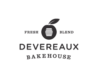
Devereaux specialise in blends; fruit & nut blends, spice & cream blends, they also make their own herbal tea blends. All their baked goods have a specific blending combination that gives their breads, buns & cakes a unique flair. The mark is inspired by their award winning honey-apricot rye loaf. The apricot stone doubles as a honey wand, suggesting a literal manner of 'blending' both flavours.
Status:
Client work
Viewed:
10338
Tags:
Fresh
•
Classic
•
Blend
•
Apricot
Share:


Lets Discuss
Kerning on a curve! Nice!
ReplyHaha!! Thanks Bart :)
ReplyClever work
ReplyIndeed, superb work Josh!
ReplyGreat work Josh!
ReplyThanks lads :) BTW the cinnamon & coffee cream rolls will leave you in awe!!!
ReplyAssuming this is the final? Love it, turned out great!
Replyfresh:)
Reply@Sean - Yep final version :) Thanks!!
Reply@Deividas - Thanks man!!
The mark is inspired by their award winning honey-apricot rye loaf.
ReplyI see that :) nice clean work and Bakehouse looks good :)
Thanks Mike!! haha yeah, the X games of kerning :D
Replygreaaat
ReplyThanks 1ta!! I'm pretty happy with how this turned out :)
Replythe balance here worked out awesome.
ReplyThanks Colin!!! I'm glad to hear that, I think I spent just as much time selecting & formatting typefaces as I did sketching up the mark :)
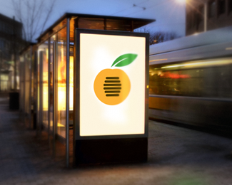
ReplyAdded some new variations. Packaging & signage mockups.
Replynot sure if this is a done deal yet josh, but the kerning in \'devereaux\' appears to be slightly off. seems to be a little tight in the \'ere\' bit. lovin\' the variations with the mockups.
ReplyThanks Colin, that pesky kerning ;)
ReplyFirst time i\'ve seen this... love the concept and colour palette
ReplyThanks Dan!!! In regards to your forum post in regards to what stationery to use for thumbnail sketching, an early version of the idea was roughed out onto a restaurant napkin, with an ordinary ball point (which I borrowed from the waitress).
ReplyWow I like where this ended up, nice job!!
ReplyWow I like where this ended up, nice job!!
ReplyThank you twice ;)
Replyjust great work! nothing more to add
ReplyThanks guys :)
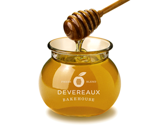
ReplyNice one, Josh. As said earlier, love how it looks reversed out on the honey jar!
ReplyThanks Kev!! The honey jars might go into production, depending on $$ :)
ReplyPlease login/signup to make a comment, registration is easy