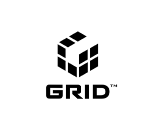
GRID (round)
by Logomotive • Uploaded: May. 08 '12 - Gallerized: May. '12
Description:
GRID Logo for an APP business.
Status:
Work in progress
Viewed:
13268
Tags:
•
Grid
•
G
•
Round
Share:
Lets Discuss
Mike, as always...
Reply@ diev, :) thanks I guess...
ReplyMike....I hate you! This is so simple it works! Love it!
ReplyBart, that means a lot to me, more than you know. Thanks Bro.
ReplySo smart Mike, great as usual.
ReplyNice one Mike, love the custom type here too!!!
ReplyNicely done, Big Mike. Solid.
ReplyThanks Amigos!
ReplyUploaded a variation. Let me know your thoughts.
ReplyThe round version balances better, but it may have lost some 'masculinity' in the form...whether that suits the brief better I don't know. But in any case I prefer the vertical/stacked orientation better.
ReplyThanks Josh, I think the round version brings out the G more and also 'focuses' more on the app's. I also like the stacked version better :)
Replyhmmm...i actually prefer the first version. i think the structured mark correlates better next to the type and even to the word 'GRID'. however, the round vertical version definitely brings the 'G' out more. either way, you have a great concept here, mike...not sure you can go wrong either way.
ReplyThanks Colin, does the fourth square (expanded app. occupying negative space) make sense? Not sure if it conveys or not. Appreciate your feedback guys.
ReplyNice concept, nice typo work
Replywell balanced as well, floated!
"fourth square (expanded app. occupying negative space) make sense"
ReplyAs in the grid is scafolding (framework) for use of building onto an additional building (sector) ? If so, then yes :)
Great piece of work, I love the simplicity of it - and yet it transmits so much.
ReplyGreat solution, man! Really love how the negative space turned out in the mark. Nice custom type too! But look who I'm talking to!
ReplyThank you guys. Unfortunately it does not 'tilt' the client, whatever that means. Perhaps it can work for Google Plus? :)
ReplyJosh, yeah sort of like that.
Oc, I thought so, and appreciate your understanding of my thinking.
Mike.. please stop being so good!
ReplyThanks for the support JP, wish clients felt the same though.
ReplyI prefer the first version, the second reminds me of an orange.
ReplyI think it's a nice solution, but it seems that something is missing in the square. Like the new Shutterstock logo, which has a space to be filled.
Thanks Cassano. I also prefer this version. Would make for a great APP icon. Client decided on another. Still figuring The apple app thing out.
ReplyPerfect execution.
ReplyPlease login/signup to make a comment, registration is easy