Maverick w/type
by malicho • Uploaded: Mar. 30 '12 - Gallerized: May. '12

Float
(Floaters:
62 )
Description:
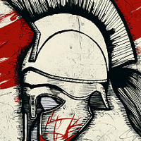
This will likely be my last posting on this logo since it's all but done until I get further word on it. It's a rebranding idea for a school's athletic program, they're the Mavericks as you can see. Here's the current logo:
http://www.mesamavs.com/
Thought Id' add the "Mavs" type in since this is now the official logo with type, feedback is always appreciated.
Status:
Unused proposal
Viewed:
18889
Tags:
school
•
university
•
mesa
•
colorado
Share:


Lets Discuss
good type positioning, it helps create an overall shield shape, one thing, i feel the type could be more simple as in not having the extra lines you've added, its a bit distracting
ReplyI agree, but what a great improvement! Nice and solid.
ReplyI saw the proposals without the typo
Replyand this is def my favorite one, the
text it's nice integrated, imo this
is gold solid I like it a lot, the
current logo it's ugly as the
typeface they are using yours
it's much better!
One only critique... the eye it's
a bit little, I'd like to see a
bigger eye with an agressive feeling
Floated and Faved, Keep it UP!
thank you guys, both your suggestions i believe i'll include on the final, a larger/simpler eye and cleaning up the text a bit. thank you for the suggestions.
Replynice one! catch my float :)
ReplyThis is good feeling)
Replythank you guys :)
ReplyReally good to see some quality logos recently. This is one perfect example. Nice work Brian.
ReplyThank you Norman, that means a lot coming from a designer of your quality. And I agree, there are a lot of good quality and unique designs coming out lately. Keep them coming, I need all the inspiration I can get.
Replyman ... that's yours ... great piece ... love it !!
Reply@TaS haha yeah it's mine, thanks for the float buddy.
ReplyBad ass!! :)
ReplyAmazing! this is gonna be one hot logo to sport on a hoodie!
Replythanks robin :)
Replythank you John, hopefully they approve of the design.
Replystrong
ReplyI agree with what has been said. The eye can be improved and thin lines are unnecessary in typography. And I also see three arrows in M, in the A and V, was that intentional?
ReplyI'm waiting to see the final version.
Hello Brian.
ReplyMy name is Dip Dhingani and I run a software development studio. We are an enthusiastic and we are looking for an excellent designer to design our logo. I love your work and your logos. I was wondering if you were interested in providing us your skills to design a very attractive logo for us. If you wish to speak to me you can contact me on my email: dipdhingani2@gmail.com.
I will wait for your reply.
Best regards!
Strong mark :)
Replylove it, very prominent logo. Bravo.
Replywould you be willing to sell the logo? I own a hockey school company and my teams are looking for a logo. were called the mavericks. email me if youre interested proplayhockey@gmail.com
ReplyPlease login/signup to make a comment, registration is easy