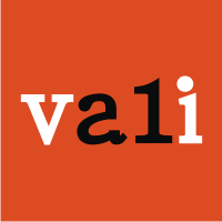
cat
by vali21 • Uploaded: Mar. 23 '12 - Gallerized: Mar. '12

Float
(Floaters:
65 )
Description:
My cat on simple vision!...:)
Status:
Unused proposal
Viewed:
30066
Tags:
cat
•
smart logo
•
cat logo
•
vali21
Share:

Lets Discuss
simply brilliant! i really love it! compliments
ReplyThanks all 4 appreciations!**Leonardo Da Vinci said:*ȁCSimplicity is the ultimate form of sophistication!%22 ...and my logos concepts follow this maxim!!!**Thanks again*vali21
Replyread: simplicity...
Replykitty cat! nice !
ReplyThanks julius :)
Replylove it!
Replysimple, clean and awesome!!
ReplyThanks guys...:)
Replyawesome! I really love it :) *purring*
Replyhate to be the douchebag here but really don't think this deserves the gallery spot... even if i look at it as a typography logo it falls so short from much better deserving logos in this genre...
Reply@JohnM...I'm not looking for critique dear friend! I post a simple, very simple cat logo and I love it. Much more than your 'zombiecat':)
Replyps: It's so hard to make friends and too easy to make enemies!
vali : i didn't say this was a bad logo... i just said this one doesn't belong in the gallery... usually the creme de la creme makes it to the gallery... and it wasn't a critique it was merely an observation... am sorry to have hurt your ego there! peace out man!
ReplyAnd yea i really didnt expect such an observation will make me an enemy! you sound a bit like sheldon from the big bang theory there!
looks like comforta font. am i right? great mark. id bring the c and t a little tighter.
Reply@JohnM:
ReplyI beg you: do not make any comments at my logos. I don't care ...and don't need them...and I'll do the same! You humiliated me and also other designers like me.
Because we are new on this site means our logos don't deserve to be in gallery - just 'creme de la creme' deserve it? Thanks God you don't decide what logos goes or not in gallery. Point.
Sans le respect Votre Majesté «crème de la crème»!
Sans le respect Votre Majeste Creme de la Creme!
Reply@emesghali - Thanks...the font is not comforta, I used Arista Light!
Replywell done!
ReplyThanks admx!
Replyvery well
ReplyGreat Logo. How can I contact you? I would like to hire you for some logo work. Sorry to send the message here, but I am brand new and couldn't find a way to send you a pm. I wish you the best.
ReplyThanks all!
Reply@alexdantas my e-mail is:
vali.cadar@dsign4aces.com
amaaziinnnggggg
Replythanks samijoemansour ....:)!
ReplyLove the simplicity! Reads well super small too.
ReplyPlease login/signup to make a comment, registration is easy