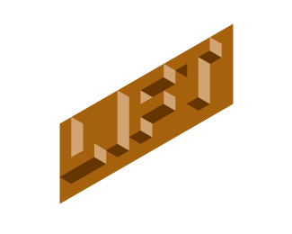
Lift v2
by KGB • Uploaded: Sep. 05 '07

Float
(Floaters:
9 )
Description:
logo for Coffee and Smoothie bar
Status:
Unused proposal
Viewed:
3938
Share:
Lets Discuss
sweet! so the style possibly represents steam from a coffee cup? i like then how you went with a non coffee related color in order to tie in the smoothie part.
Replyi like it! nice concept
Replynice carving..%0D*I like this mark.%0D*But, someway it look like an Onion. Inspiration comes from any where. %0D*Maybe, I overlooked this mark due to the admire.
Replythe idea was the steam from coffee or the aroma/energy of a smoothie rising from a cup to create the business name. It does look a bit like an onion. Especially before when the letters were connected at the bottom. thanks for all the kind words.
ReplyIt's one of those scary sci-fi forests in videogames. No really, I don't get a coffee vibe from this mark. Why did you use purple anyway?
Replysteam rising from a coffee cup. purple to represent the smoothie side of the business.
ReplyKGB, no offence man, but from the first glance I could smell the onion, not the coffee. I don't know if you want this kind of reaction from people... did you try making LIFT look like a cappuccino cup with that saucer u have there, where only %22F%22 is the steam... just an idea
ReplyWas this the design chosen by the client?
ReplyI did these for an agency and a concept they created was chosen by their client. I just thought I'd share my executions. I got onion from it too, but I think the idea is good. My execution just fell a little short.
ReplyI did these for an agency and a concept they created was chosen by their client. I just thought I'd share my executions. I got onion from it too, but I think the idea is good. My execution just fell a little short..
ReplyI really like the design but I saw an onion as well, and didn't catch the words 'Lift' until later. The curl in the crossbar of the F and the colour makes it more onion like.**
ReplyPlease login/signup to make a comment, registration is easy