Metrio Coffee
by robinssoncravents • Uploaded: Jan. 28 '12 - Gallerized: Jan. '12
Description:
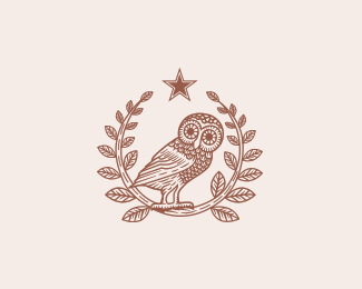
The Metrio Coffee identity was first inspired by the classical vintage themes of ancient Greece (the Athenian owl and olive branches) and later combined with a modern yet simple design. The word Metrio is derived by the most common way Greeks drink their short black coffee - METRIO - meaning short black with one sugar (medium sweetness). The combination of the name, the traditional themes and selected colours (brown, coffee, silver, blue, gold) compliment the overall design and gives the brand the classical, fresh and simple perspective it requires to make its mark.
As seen on:
http://www.behance.net/gallery/Metrio-Coffee-Visual-Identity/497718
Status:
Client work
Viewed:
8811
Tags:
Engrave
•
Greek
•
Illustration
•
Owl
Share:

Lets Discuss
Looks amazing!
Replybeautiful
Replymy lovely owl!
Replytop shelf
Replythis is just awesome in every way
ReplyGreat logo!*Very nice and detailed mark illustration.*I only don't get what the star stands for? - star reminds me a bit of Heineken beer %3B)
ReplyNice illustration, like your style
ReplyAlways adore your work! Your branding design is awesome!
ReplyAmazing logo!
ReplyPlease login/signup to make a comment, registration is easy