ok agency
by ASD • Uploaded: Jan. 27 '12
Description:
advertising agency
/continuation/ :)
Status:
Work in progress
Viewed:
4539
Share:
Lets Discuss
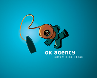
HA!!!!! Man, I really LOVE what you're doing here. The fact that you're reusing that character, and putting him into various environments is brilliant. I think this is a really excellent way of building versatility in this brand. **Couple of things though, if I may:**I think your astronaut reads a bit better as %22OK%22 than this diver does. I think if you were to tilt the diver to a similar angle as your astronaut, it would read better.**Also, I know that a traditional diver's helmet is often a very different color than the diving suit, but colorizing the head and the body differently here also makes it harder to get the %22OK%22 connection. In your astronaut lockup, the helmet and suit are the same color (white), so reading %22OK%22 is easier. I think that if the diver's helmet and suit were similar colors, it would also make the %22OK%22 association easier.**Overall, I think you've got a really cool concept going on here, and I'm really curious to see how this develops.
ReplyWOW, I didn't realize it actually read %22OK%22. Pretty awesome.
ReplyThank you all, thank you Jon for your help.
ReplyYou bet, man. I am really curious to see how this branding exercise develops. Are there plans to apply this mark to more components in a full branding suite? I would love to see your solution for business cards, stationery, vehicle wraps, whatever. I think it has tremendous potential.
ReplyIt all ended quite banal. The sign - orange ))) Can not even show :(
Replybest !!
ReplyIt's very cool!
ReplyPlease login/signup to make a comment, registration is easy