Hyper**** WIP
by AlexWende • Uploaded: Jan. 23 '12

Float
(Floaters:
25 )
Description:
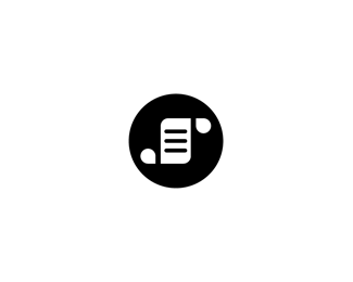
Logo Design work in progress for a games developer.
Some of the client requests were:
- a simple unique geometric symbol
- a play with negative space / or a paradoxical logo
- it should be as simple that it could be used as a stamp or a favicon
It's not the full name of the company but I wanted to share a sample of the possible typography...
As seen on:
http://dribbble.com/alexwende
Status:
Unused proposal
Viewed:
3187
Share:


Lets Discuss
Hi Alex ... das ist %FCberzeugend ... great work !
ReplyThis really turned out nice, Alex.
ReplyNice :)
ReplyI agree, nice one here, Alex.
ReplyBernd, Mike, Bayu, Sean thanks! Working on the last proposal now :)
ReplyI LOVE THIS H!
Replyhypersimple :)
ReplyThe mark reminds me of vintage video games. Nice work bud.
ReplySolid work here, i enjoy the eye-play. And a beautiful type!
ReplyThanks Rudy, really appreciated!**@logtek: True, it's pretty simple but I think it has potential for different branding purposes %3D)**@Norman: I hope the reminiscence of vintage video games does not mean it looks dated?**@Stelian: Glad you enjoy it, hope the client looks at it the same way as you do :D
ReplyCertainly not Al! Its by far the opposite my friend. Apart from vid games like snake and pacman, it also reminds me of Qix! This reminiscence of course is subjective and a proof of how ancient I am %3B)
ReplyIt reminds me that logo:**http://www.halkbank.com.tr/
Replywow that's pretty similar, small world. This is gonna be unused anyway :/
ReplyGood solution Alex.
ReplyPlease login/signup to make a comment, registration is easy