Description:
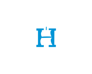
Logotype for a company specialized in web and application development.
As seen on:
- Status:
Work in progress Viewed:
5260
Tags:
tamedo
•
type
•
logo
•
web Share:
This is very well done and unique. I think the lines of the %22a and e%22 are a bit short and should be a bit longer imho. Great stuff nonetheless %3D)
Mikey, Nitish, Sean, Muamer (iso medo u ducan:),Bernd, Nick, Alex, thanks a lot for your thoughts guys! *@Alex*I think you're right. Updated with longer lines on the %22a%22 %26 %22e%22. What do you think now?
Ali, Mikey, Alex, I appreciate it fellas!*@Alex,*Yeah, it works better this way, thanks for your constructive input ,my good man.**It's always nice to get compliments from your design colleges and friends but criticism from talented individuals here on Pond is gold for me. No matter how good and experienced you are, an extra pair of eyes will always bring you better results. Well, at least in my book:)
I would join the choir, it is really a great lettering, although it is quite unusual choice for a web development company, to me it speaks more like a jewelry or something luxurious.
Majstore Luka, puno hvala:) @neogrey(Homer Simpson:)
Cheers, for the compliments. I did tried what you've suggested, it would work I think. And btw.client after-all decided to go with a different approach.
Thanks again for the constructive feedback


Lets Discuss
like it, Roko.
Replycool Roko
ReplyFunky, Roko, funky!
ReplyNice Roko (medo ta medo :)
Replywow ... beautiful type Rokac
ReplyNeat type.
ReplyThis is very well done and unique. I think the lines of the %22a and e%22 are a bit short and should be a bit longer imho. Great stuff nonetheless %3D)
ReplyMikey, Nitish, Sean, Muamer (iso medo u ducan:),Bernd, Nick, Alex, thanks a lot for your thoughts guys! *@Alex*I think you're right. Updated with longer lines on the %22a%22 %26 %22e%22. What do you think now?
Replygreat type, very original:)
ReplyAlways a pleasure hearing from you, Deividas:)
ReplyThis is so awesome type man! I totally agree with Alex suggestions.
Replyhave to agree, nice subtle change on the %22a%22 and %22e%22.
ReplyLike it even better Roko :)
ReplyAli, Mikey, Alex, I appreciate it fellas!*@Alex,*Yeah, it works better this way, thanks for your constructive input ,my good man.**It's always nice to get compliments from your design colleges and friends but criticism from talented individuals here on Pond is gold for me. No matter how good and experienced you are, an extra pair of eyes will always bring you better results. Well, at least in my book:)
Reply@Roko, your welcome. I always try to if I see something. Can't agree more with you about the feedback thing, well said!
ReplyExcellent logotype, Roko! Love the line work, and the techy, futuristic quality of the type lends itself beautifuy to a web dev company.
ReplyBuddy, this type is awesome. Love it.
ReplyCool type.
ReplyThierry,Alex,Jon,Milosz,gilevad, merci/danke/thanks/dziekuje!*@Jon*Very nice description buddy!
ReplyOh yeah! Thats nice!
ReplyThis is different and that's why I really love this work. Very nice type.
Replygreat type!
ReplyAction, lumo, yhanktou, I appreciate it fellas! Waiting to hear from the client.
ReplyPure beauty Roko
ReplyThanks a lot Radek.
ReplySuper ti je ovo. Onako, deluje futuristicno.
ReplyPuno ti hvala Jovane! Doduse, klijent je odabrao drugi koncept, ali u svakom slucaju super projekt...
ReplyVery beautiful type!
ReplyThanks T-Rex:)
ReplyI would join the choir, it is really a great lettering, although it is quite unusual choice for a web development company, to me it speaks more like a jewelry or something luxurious.
ReplyGreat type! You so well combined lower %22e%22 and %22a%22 with the rest capital letters - very nice!
ReplyMajstore Luka, puno hvala:)
Reply@neogrey(Homer Simpson:)
Cheers, for the compliments. I did tried what you've suggested, it would work I think. And btw.client after-all decided to go with a different approach.
Thanks again for the constructive feedback
Please login/signup to make a comment, registration is easy