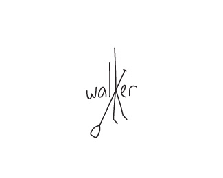
Walker SUP's
by VERG • Uploaded: Oct. 11 '11 - Gallerized: Mar. '13

Float
(Floaters:
38 )
Description:
1st idea for a Stand Up Paddle board (SUP) label
Status:
Work in progress
Viewed:
6250
Tags:
design agency
•
matt vergotis
•
verg advertising
•
verg
Share:


Lets Discuss
no....sorry
Reply%5EGotta love Sergey's helpful critiques. :D
ReplyI'm thrown off by the tophat. Was that a consideration outlined in the creative brief? Even if it was, I'm having a hard time associating it with paddleboards. In fact, the only reference to paddleboarding is the curved paddle in the flag. If you could describe your thought process a little more, it might help me to better understand this concept.
ReplyI said that earlier, this is cool Matt. Type is awesome.
ReplyAgree ... that's really cool !
Replyguys, all is relative:)**the second option - a much better
Replyreally nice execution, but I'm not understanding it..
Replyhi all and thanks everyone for taking the time to make a few comments. perhaps i should put a little more energy into the description when uploading my logos. **there's a couple of things going on here, but first and foremost, i didn't want to create a mark that visually translated to stand up paddle boarding. the top hat was intended to be a bridge to the marketing ideas i had in mind when advertising the product, whereby hero shots would have surfers riding SUP's with a top hat. What drew me to the top hat initially was an iconic surfer of the 50's and 60's the late Micky Dora. Google image his name and you'll come across a fantastic black and white photo of him wearing a top hat. He had a unique style in and out of the water and went against the grain of the corporate and professional surfing scene - he was the original %22freesurfer%22. I also had some other ideas for the board art that would explain the red band on the top hat. **I guess this is a logo that would be better appreciated when seen in conjunction with the product, advertising and the character evolution i had in mind.
ReplyWhat program(s) do you use to create your logos?**Also, as a side note, I only am a prospect as of now on dribbble and can't make comments there, but I would like to say I like your work on there, as well. (I really like your giraffe and elephant!)
ReplyG'day aspect. Everything I do starts out as tiny little drawings that fill up my sketchpad. Once I feel 100%25 confident in a direction do I take a photo with my iPhone (RIP scanner) of the sketch, then magically bring it into my computer to vectorize in illustrator. I only ever use illustrator for logo work. In some cases I may slap on a texture for presentation in photoshop, but in this instance, the texture was created in illustrator.
ReplyThe name's Andrew, by the way :)**I myself have a hard time with Illustrator, mainly because I am so used to using Photoshop (%7E7 years) and I just got AI less than a year ago. Good stuff, though :) **Also, thanks for the %22WIPs%22 on dribbble, love seeing the process
ReplySorry Andrew, i couldn't find your name in your profile. Well that's your first step right there - familiarise yourself as best as you can with illustrator - understand that pen tool (p) as best as you can and Tutt yourself silly. once you understand the basic fundamentals of illustrator, everything else is secondary.
ReplyPlease login/signup to make a comment, registration is easy