MooFish Cafe
by Brandsanity • Uploaded: Jul. 25 '11
Description:
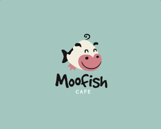
WIP logo design for a coffee shop. "Would you like milk with that?" "Mooooo!" *SPLASH*
As seen on:
Brandsanity
Status:
Work in progress
Viewed:
14543
Tags:
animal
•
swim
•
water
•
udder
Share:



Lets Discuss
very fun
ReplyCheers Hossein :)
ReplyThat would be a very weird fish to catch lol... Looking good though love the colors, fonts, and concept :D
Replypretty cool. good job mate
Replynice fusion! Love the type too... perhaps just tweak one of the O's a little to make it different to the other. top work!
ReplyAs simple and whimsical as this one is at first glance, there's actually a lot of complexity to the way its rendered, which is why it works so well. I can tell a lot of thought went into how to execute this so that the end result looks effortless. Some will not consciously pick up on this complexity, but I see it, and it's brilliant. When I first looked at this, I obviously saw a cow that doubles as a fish, but after studying it a bit more, I'm seeing that the cow's nostrils are also the fish's eyes, while the cow's eyes are also the fish's eyebrows. The shape of the cow's pink snout is important, because it also frames the fish's face. And the icing on the cake is the cow's udder, which is also the fish's pectoral or pelvic fin. very, very well done. My only nitpicky comment is one that Matt already pointed out: You should alter one of those Os so that they look truly hand-rendered.
Replywoa! i love this so much, you have a great ability to create appealing characters, nice type to pair it with too!**Jon i just read your comment, amazing eye!
ReplyHah! Good one !
ReplyThanks for the kind words and floats everyone! Really appreciate it as always. Just gave one of the o's a little tweaking.**@atomicvibe Wow, as Reno said, great eye man... Who'd have thought I could achieve all that without even knowing?! Haha, in complete honesty I didn't even see the other fish until you mentioned- but since spotting it I've begun to push the imagery further by aligning the various parts up (eyes, eyebrows) a little better. Well spotted! You are definitely right about it appearing simple but a lot of time going into constructing though :). You've provided great feedback on a few of my designs now, so cheers for that!
Replythst is really really nice ... !!
ReplyIf you were able to achieve all that w/o consciously knowing about it, that says a lot about your natural inclination towards design. Bravo!
Replypretty.. :)
ReplyNeat illustration. I like these colors.
ReplyGreat combo :)
ReplyHaha, not so sure about that Jon!**Thanks all for the comments and floats.**@nick The colours were referenced from a palette on ColourLovers so I probably shouldn't take credit for them! Great website though for colour ideas and combinations.
ReplyGreat logo, good
ReplyThis MooFish so cute!
Replythat must be the real milkfish :3 kawai
ReplyLove this! Just noticed the font similarity with my Lensfish! :D http://logopond.com/gallery/detail/78903
ReplyPlease login/signup to make a comment, registration is easy