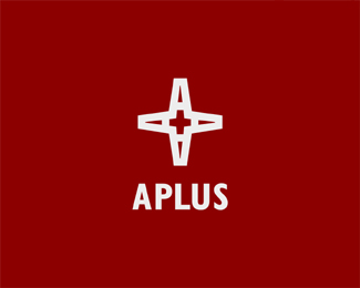
I like your thought process, but I think the other execution is more successful at communicating both an A and a plus symbol. Here, the plus is more cross-like. Which would be perfect if this were for A Ministries, or something.
Nice idea, but I don't like the size of the plus sign in the negative space. Seems too coincidental, rather than intentional. I actually associate with a cross more than an additional sign.


Lets Discuss
Thanks zeebrands.%3B
ReplyI like your thought process, but I think the other execution is more successful at communicating both an A and a plus symbol. Here, the plus is more cross-like. Which would be perfect if this were for A Ministries, or something.
ReplyNice idea, but I don't like the size of the plus sign in the negative space. Seems too coincidental, rather than intentional. I actually associate with a cross more than an additional sign.
Reply%5E%5EWow, I totally should read all posts before I go on my own rants. Sorry. Instead, I will say I agree with atomicvibe.
ReplyPlease login/signup to make a comment, registration is easy