Highly Decorated
by fools-e • Uploaded: Jul. 09 '11

Float
(Floaters:
3 )
Description:
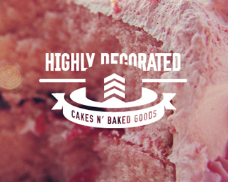
Logo for a bakery run by a retired military man and his wife.
Status:
Nothing set
Viewed:
2833
Share:


Lets Discuss
Great idea, I just wish I could see the rest of the cake more.
Replyamazing idea, but man this is so hard to see. do not give up on this one. I'm not sure what you mean (%5Eclimax) by 'biting' into the text, could you elaborate a little? I think the main problem right now is the lack of definition of the overall cake shape. The subtle shadows just aren't enough. I think you could get away with getting rid of the shadows and simply making the cake shape the same color brown as the current shadows. It will make the shape more apparent, but the 'bars' will still be the most apparent part of the logo. This would free you up to do the main typography a little cleaner instead of stairstepping it like it currently is executed. You could put the type on a slight arc, like they do in many old army badges.**Cool stuff!
ReplyI think what David is attempting to say is that the words should be missing areas that the cake overlaps into. Which would work. What may also help is the cake shadow be regarded as a cake plate, and show on each side of the negative-space cake. And, the dark brown should be black. Not easy to see.
Replyfor me, this has turned into a classic case of 'once you see it, it's all you can see'. I still think there is a stronger way of executing this concept, but I do believe that it is very sellable right now. It's also one of those images that is much more visible at a smaller size than it is when large.
ReplyI don't see it.
Replyit's a round cake with one triangular slice cut out of it. The slice is pointing right at you, and doubles as the military 'bars'. The cake is brown and the inside of it is white.
Replyare you sean farrell?...
Replyhttp://dribbble.com/shots/209231-Just-an-idea?list%3Deveryone
Replyok... I see what's happening.. I think...
ReplyI'm sorry, but if you have to work that hard to see it, it's not there yet. Even though I did work out what was intended eventually, I have to work to see it every time I look at it.
Replyvery clever but a bit of a trick to my eyes
ReplyI totally see both the chevron military stripes as well as the cake, but, as others have mentioned, it is quite hard to pick up on, especially for non-designers who aren't trained to look at both positive and negative space. I think what could really help out is manipulating the type so that the letters help form more of the edges of the cake. Keep going with this one. The concept is SO strong%3B just need the execution to catch up a bit.
ReplyPlease login/signup to make a comment, registration is easy