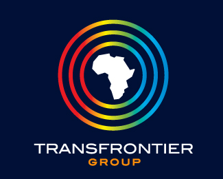
Mindsapce Africa
by BrandonBarnard • Uploaded: Jul. 18 '07

Float
(Floaters:
0 )
Description:
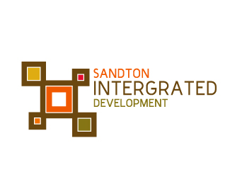
This was team effort Between Peter & myself (Brandon). I wanted to create a logo that had an african feel & western sophistication. Thier primary focus is soccer expanding into africa, so I wanted that to come through in the logo
As seen on:
www.agentorange.co.za
Status:
Nothing set
Viewed:
3415
Share:

Lets Discuss
I do not see the %22soccer%22, but I can see the modern and smart look more than the african feel.
ReplyThe type is neither african nor occidental for me, it is rather tech/space. I think the final brown stroke on the exterior could be a little thicker - or having them all the same stroke.
ReplyNice but sorry to be so harsh but I don't really like this type. I think there are so many ways to make a logo %22modern%22 and this kind of freebie-futuristic font is not an answer. I think a lot of letters have to be rebuilt (some are too extended, others too condensed, some seems not to be the same font...), the kerning could also be improved or... drop this font. But coulours and mark are very good :-)
ReplyDache %26 duckland thanks for comments. The pattern itself is very african if you look at tribes like a venda, xhosa, tswati, ndebele this are shapes and prints that you commonly find as well as the colours. I wanted the font to be in comtrast to the icon, i like the fact they you said it looks futurist.
ReplyThomas %26 others**thanks for the input, So you all really hate the font, could you maybe suggest a better font i am open to suggestions
ReplyVariable, Preface, Index, Lineto Mono, Sentinel, Kontrapunkt (free), Cinecav, Sauna, Mercado, Myers, Mister Giacco...
ReplyPlease login/signup to make a comment, registration is easy