Atelier
by VERG • Uploaded: Jun. 27 '11
Description:
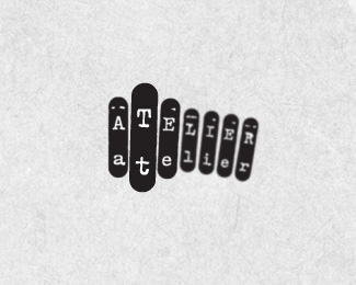
Hammer keys on a type writer representing a collaboration of many to produce diverse and infinite outcomes. The word Atelier means studio and is an Australian co-working project.
As seen on:
BEHANCE
Status:
Client work
Viewed:
5817
Tags:
keys
•
hammer keys
•
co-working
•
type writer
Share:

Lets Discuss
I love this. Nice work.
ReplyThanks heaps Harley... Glad you like!
Replymeant to say ...great showcase mate
ReplyI love this concept, Matt. Very fresh and creative. And the execution is cool, too. I love how you really get a sense of depth from the out-of-focus elements in the background. But I'm curious about the blurriness: is this all done with vectors? Just wondering about practical applications if the blur was added in Photoshop.
Reply@ cerise... that's a huge compliment, thank you mate!*@ jon... cheers mate! to answer your question, the blurs are applied in illustrator. it's not a technique i've used within illustrator before and the collatoral hasn't been rolled out yet so i'm unsure of whether it will cause me any issues, i assume it probably will when it appears on a solid background colour - but like i've done for this presentation i can multiply the logo to the background. there is a version for the client that doesn't have the blur which i think they prefer anyway. *I really enjoyed doing this job. the client wanted something that was anti-corporate. At one point i pitched an idea that we buy an antique typewriter on ebay. I would illustrate some frame on a sheet of paper that was to be fed through the type write. She would type in the word and voila! there was her logo. She could frame the original, wall mount the typerwriter and there would be a story behind the logo.
ReplyI've never seen anything like this. That's why I love it. Great work.
Replythanks sam!
ReplyThis is awesome! Wonderfully creative and beautifully executed.
ReplyMatt, your antique typewriter idea sounds wonderfully creative and thoughtful. It's a shame your client didn't go for it. Don't get me wrong, I absolutely love this current logo, but I really appreciate when a creative work has a personal story behind it.
Replygenius thinking here:)
Reply@ Trish, Deividas: thank you very much. i'm absolutely stoked you like. *@ Jon: I kind of got blank stares to that idea when i suggested it, so i had a few typewriter inspired options up my sleeve and the client immediately fell in love with this version. You never know, the opportunity in the future to use that idea may comer up. maybe for myself(?)
ReplyCooles :)
ReplyCheers verde
ReplyPlease login/signup to make a comment, registration is easy