RINO Excavating
by Mikeymike • Uploaded: Jun. 05 '11 - Gallerized: Jun. '11
Description:
WIP_V1
Still experimenting.
Thoughts?
Status:
Work in progress
Viewed:
15141
Share:


Lets Discuss
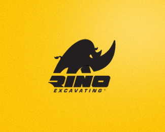
Awesome. I can feel that thing charging at whatever is on its right. The nostril feels unnecessary and distracting though. Maybe the tail as well. %0D*The RINO type is excellent, as is the entire composition. Faved floated.
ReplyThere's a strange, darker overlapping slice where the front arm meets the body. And the nostril could be slightly bigger. Besides that, it's really nice.
Replythe nostril or mouth or whatever it is, is distracting. love all the rest. :)
ReplyHummmm may have to get rid of it. thanks
ReplyUPDATED: took off the nostril.
ReplyUPDATED: Thanks David. looks a tad tighter now.
Replygreat job, mike. love the type.
ReplyI dig it! :P Sorry, couldn't resist. Great feel here, nice Rhino! I like David's comment, might even try a version where excavating is bigger yet, not really tracked out - the whole mark and the foundation would feel big and bold top to bottom, just a thought. Nice again, Mike!
ReplyGreat strong character!
ReplyYes, really strong !
Replyangry one
ReplyColin, Sean, Fabian, Raoul and Florin, thanks for the supportive comments. Really appreciate it.*@ Sean, yeah I may have to experiment with that bottom type somemore.*I kind of like how the icon and the name RINO just stand out so strong now, but it might not take away if the Excavating is larger and not kerned as much. Strength that's what this is all about. Thanks, man. good suggestions form a few of you thanks.
ReplyI see what you mean. Thanks David. I'll take a closer look after i finalize a couple other projects that hopped on the faster burner first. thanks again. cheers.
ReplyGreat character and nice integration type with mark. Strong!
ReplyThanks, jovan.
ReplyMikey, you're doing great things with animals, recently. Really nice treatments.
ReplyGreat styling!
ReplyMilou, thanks for the comment. yeah I have always like to do the animal direction when it fits the brand and business.*Nekiy,thanks.
Replythanks for all the floats and the gallery spot.
ReplyLove this mark!!!
ReplyGreat stuff! The logo really jumps out of the page! I could definitely envision this beast as part of the %3Ca href%3D%22http://www.dpm.net.au/about/branding/%22%3Ebranding%3C/a%3E for an industrial company of some sort. Great job!*
ReplyVery strong mark!
ReplyTHX, everyone.
ReplyUPDATED: worked on cleaning up the bottom type a little.
Replythank you, mahmoudisthere.
ReplyInteresting to see another rhino logo.
ReplyThanks for the feed back, David. cheers.*Brion, thanks for the comment.*
Replynicely done
Replythank you, mahmoudhassan.
Replythx, grafiker
ReplyGreat stuff Mike!!
Replythx, Shyam. appreciate it very much.
Replyvery cool! i like the aggressive and dynamic shape! :)
ReplyThanks a lot, Tommy.
ReplyThanks for your comment your work is super out of this world!
Replythx, julian.
ReplyMan, this one is pretty badass, Mikey. I love how dynamic and aggressive it is. Seems to really fit the subject matter. That exaggerated horn is MONEY!
Replyyou've done some badass stuff yourself, Jon. thx. :)
Replylove the graphic style of rino%3B)
ReplyTHX again, Ivaylo. You have some strong graphic style yourself, man.
ReplyI love the R letter shape. It's interesting, because if it was just on its own most people wouldn't see it as a R. In the context of the whole Rhino word and the great icon, it works perfectly!
ReplyThanks, Robert, glad you like it.
ReplyNiceeeeeee!
ReplyStrong mark!
ReplyPlease login/signup to make a comment, registration is easy