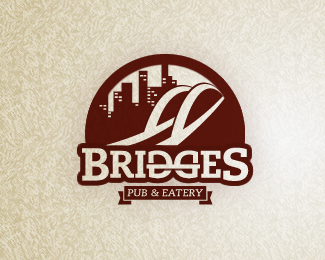
Bridges Pub & Eatery IV
by wonk • Uploaded: Jun. 01 '11 - Gallerized: Jun. '11

Float
(Floaters:
25 )
Description:
Another version of this logo, with a slight arch between the D and the G, as suggested by logoboom. Good idea, thanks for the suggestion!
Status:
Unused proposal
Viewed:
7933
Tags:
beer
•
restaurant
•
pub
•
bridges
Share:


Lets Discuss
yes! i like this version better. nice one!
Replythis one is nice!
ReplyYeah! very clean!
Replyhttp://logopond.com/gallery/detail/138411 :)
Reply%5E You can't see differences or why you show us the old version?*And, Stefan, this one is really good, better than old version :)
ReplyThanks again for the gallery entry comments floats!*Haha thanks Paul :)
ReplyOK, so plus signs don't seem to work in the comments. Gotta remember that. It's supposed to say %22gallery entry plus comments plus floats%22.
ReplyI actually like both the first with the bridge illy and this one a great deal. They both speak %22pub and eatery%22 nicely.**Maybe make %22Bridges%22 red like the bridge was? Keep the other text the gray?**Beautifully done.
ReplyThe site feels faster than before, so whatever it is you're doing, it's working :)
ReplyIn love with this typeface! What is it??
ReplyThanks Chris, it's called Caecilia.
Replylike how you bridged the two letters together, cool
ReplyPlease login/signup to make a comment, registration is easy