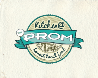
Kitchen @ the Prom
by orcadesign • Uploaded: May. 27 '11 - Gallerized: Nov. '12
Description:
New logo for a local cafe/bar/restaurant.
Status:
Client work
Viewed:
11620
Tags:
restaurant
•
cafe
•
bar
•
food
Share:


Lets Discuss
Lovely emblem, but don't sure about letters PROM - they need for softer font
ReplyThanks. The ‘PROM' is actually the existing logo of the bar, we were asked to incorporate it into the new logo for the kitchen.
Replyvery nice work ... like it
Replynice..
ReplyIt feels nicely hand-done, which seems to reflect the nature of the business. It's a shame you had to work in their old logo, but I can understand its necessity. Those letterforms could really use a bit of polishing up, though. It would have been great if you could have impressed upon your client the need for a main logo update *first*, and *THEN* this spinoff, but I realize you're just doing what was asked of you.
ReplyI hear you there atomicvibe! Sadly we couldn’t sway the client, in fact it took a lot of persuading just to let us include the shadow on the lettering. Still, the client’s happy, so we’re happy.
ReplyPlease login/signup to make a comment, registration is easy