ECOFUEL_V1
by Mikeymike • Uploaded: May. 23 '11
Description:
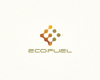
Unused mark, but decided to try doing some custom type for it.
Status:
Unused proposal
Viewed:
6364
Tags:
gas
•
green
•
safe
•
enviroment
Share:


Lets Discuss
trying some custom type on for size on this unused mark.*Thoughts?
ReplyWhat color is the font? It looks warm gray? Would it be better if it were the olive green from the mark? I think that is the perfect font.
ReplyHey Trish, yeah, its a warm gray. I tried the olive green, but it seems to make the type feel a bit too heavy. I could thin it down. thanks, I'll take a look.
ReplyI was thinking the text could use some weight, though. If the color does it alone, I'd like to see it?
ReplyThere she be. type with the same green as in the mark. looks good. thanks.
Reply:)
ReplyI agree. I think you should use a slightly heavier weight font to balance out the mark better. I also think you could do without the drop shadow at the base of the mark - it's really distracting. I would either push the opacity of the shadow way back or omit it completely. I like the logo overall though.
Replythanks for the input, Trish and sd.
ReplyUPDATE: some minor changes. larger type and lighter shadow under droplet. cleaned it up , I think. thanks for the insight.
ReplyType is better. Personally, I would still kill the shadow though, I really don't think you need it.
ReplyTook off the shadow.
ReplyThat's better - the bottom droplet still reads as 3d without the shadow. Very nice work (as always).
ReplyThanks, Steve. and thanks for the input.
ReplyPlease login/signup to make a comment, registration is easy