Genopal 2
by Blind.[mikey] • Uploaded: Jul. 11 '07

Float
(Floaters:
1 )
Description:
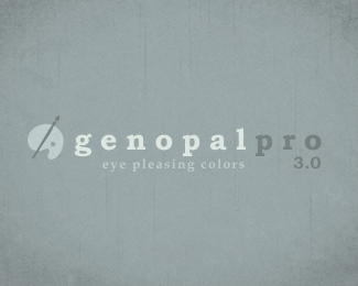
A logo proposal for a superb color pallet program. Alternative colors
Status:
Nothing set
Viewed:
1677
Share:


Lets Discuss
wow man this is good...i think the colors in this make it more friendly and welcoming than the blue...i think probably the thickness of the stroke at the 'mouth' of the g should be more visible...with the same stroke as the outer g and the otha letters...if u kno wot i mean
ReplyThank your jeropp! I understand your point. The problem was I wanted the descender on the G to match that of the P. I'm still playing around with it, but I might just cheat and make the P's descender longer %3B)
ReplyPlease login/signup to make a comment, registration is easy