papilloon
by HelveticBrands • Uploaded: Jul. 10 '07
Description:
equitable trade · FR
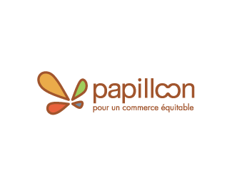
The boutique in Bourg en Bresse, France contacted me to design their new identity. Papilloon in french means butterfly and was the starting point of the design. Having the typography work just by itself was important so in joining the two “o"s a butterfly shape was created.
As seen on:
http://www.dache.ch
Status:
Nothing set
Viewed:
3044
Share:



Lets Discuss
very nice, but I think the strokes on the wings get a little clunky at the points.
ReplyI like this a lot. Only, it looks like %22papillcon%22 to me.
Replyblueoxygen, I think this is almost natural as I doubt you are in the targeted market. My clients and their clients have never had that vision.**KGB, I think its a question of image quality and its size. On the shop front you can see its all nice and curvy at the points :%5E)**Thank you for the positive feedback
ReplyDache, Nice work but I actually read the double %22oon%22 as %22con%22 also. I'm actually surprised your clients did not say anything. I'm just going by first visual that's all.
ReplyLove the mark! Good use of colors.
Reply...Though the question has come to me: Why did you merge the two 'o's together?
ReplyThere were a few other typographical solutions presented to the client which were in my opinion more legible but this was really want they wanted. This is the first time I have heard about the illegibility of the word as I have only presented this logo on french speaking websites before. I think its interesting to say the least.
ReplyPlease login/signup to make a comment, registration is easy