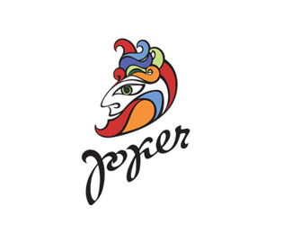
completely agree with herby. Lovely mark, fix that f/p. Type has potential but needs refinement. left side of the word is leaning to the right, and begins to lean to the left by the second 'o', but then the last three letters are straight up and down. fix this stuff and you've got a winner!
Zoya, once again, you've created a simply lovely mark. Your illustrative style gives this mark a beautifully hand-crafted, artisan feel, which seems to be perfect for a company that sells collectibles. I love how each wing is uniquely detailed, and is not just a reflection of its respective counterpart. BRAVO!


Lets Discuss
btfl!
Replynice bfly
ReplyLovely wings
Replywow! very very nice!
ReplyLove love love. At first, I saw the %22p%22 as an %22f%22 so it looked like %22comfoosio.%22
Replycompletely agree with herby. Lovely mark, fix that f/p. Type has potential but needs refinement. left side of the word is leaning to the right, and begins to lean to the left by the second 'o', but then the last three letters are straight up and down. fix this stuff and you've got a winner!
Replybeuty..:)
Replybeauty. (the %22p%22 did throw me off at first) love he illy too.
ReplyMarvelous! Congrats!
ReplyReally, really pretty.
ReplyCongrats
ReplyNice job!
ReplyAmazing!!! Well done!!! Amazing coloring!
ReplyLove this color!
Replyvery nice :) but yes, the 'p' looks like an 'f' and 'o'... the leaning letters look fine to me. it gives accent to the middle of the logo.
ReplyI've read Comfoosio.
ReplyMany thanks to all for your advice and comments.
ReplyGreat lettering!
ReplyThank you,To-To)
ReplyWow beautiful type and great style!
Replydid you update the type here?
ReplyNathan: yes)
Replybeautiful work!! Regards!! :)
Replythat's great....nice look
ReplyZoya, once again, you've created a simply lovely mark. Your illustrative style gives this mark a beautifully hand-crafted, artisan feel, which seems to be perfect for a company that sells collectibles. I love how each wing is uniquely detailed, and is not just a reflection of its respective counterpart. BRAVO!
ReplyO, Jon! Thank you very much!)
Replywow! very very nice!
ReplyLovely!
ReplyPlease login/signup to make a comment, registration is easy