Design to Feel
by SamDeMastrie • Uploaded: Mar. 11 '11

Float
(Floaters:
79 )
Description:
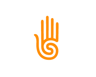
This logo represents my personal identity as a graphic designer. "Design to Feel" represents an attitude toward the process of creating successful visual solutions, where designs are more often judged not by how they look, but by how they feel. A modern re–imaging of the prehistoric hand/spiral motif fits my own design sensibilities and feels appropriate for myself as a designer. Simple and powerful.
As seen on:
SamDeMastrie
Status:
Client work
Viewed:
11664
Tags:
designtofeel
•
•
geometric
•
organic
Share:
Lets Discuss
Great mark! love the color combo.
ReplyLooks like ancient aztec symbol.
Replyit works so well!
Replyuniqe
Replyunique
ReplyThanks everyone.
ReplyIs your logo trademarked? You may want to check this out...!**http://www.shutterstock.com/pic-34139977/stock-vector-hand-with-a-spiral-symbol-on-the-palm-on-a-circle-of-hands-background.html
ReplyNo it's not trademarked. I have no idea of how to go about doing that. I'm not even sure I could though, as this hand/spiral idea is not a new or unique concept by any means. Teva has a similar mark for instance. The concept has been around for a long time, but I spent quite while making sure the geometry was perfect to give it a refined feel. Every other instance of this concept I've seen is very rough and natural looking. This shutterstock image though is the closest I've seen to mine. The fingers in particular are almost exactly the same. I'm not sure I would be able to do anything though.**Thanks for the notice!
ReplyI think cavemen beat everyone to it.**Maybe it's childhood memory, but when I see this, I am reminded not to touch a hot stove :/**Seriously, though, nice execution.
ReplyHa! I like that. Thanks Raja.
Replyit's yes!
ReplyExcellent Logo!! Good Work!! Regards!! :)
ReplySuch an awesome hand mark.
ReplyI see that you have such a good destiny...see it from your palm....:)))*Stick on that mark....love it dude!
Replyand off course drag in my favorite.....:)
ReplyThanks hanuman.
ReplySuper! Right now it looks like a Left hand... if you flip it.. it will become the right hand and will also reveal the letter %22d%22 maybe :)
ReplyA left hand? I'm not sure how you get a left hand, it's a right hand- oh now I get it, it's supposed to be palm out. And I never intended there to be a D, but there is a very subtle S, for Sam. Thanks for the your thoughts!
Replyhi! i just saw that u are a %22swimmer%22 of my logo. Im new here so can you explain what that means? %3D) Thank you!
ReplyThat just means that I voted for your logo, which means I like it. :)
Replybelieve me ... I googled it after I've read your comment ... never seen the punisher thing before ... so I deleted it ... guess I would get a bunch of wtf comments ... I think it would be really stupid to copy such a thing ...
ReplyAh, sorry man. I just thought you should know. Was it for a client?
Replyno .. I did it in 2009 for some fellows crazy for playing this soft ball stuff ...
ReplyImpressive work, visual and phonetics go hand in hand my friend, like it! like it!
Replyits a really strong mark, gj!
ReplyThank you brandingbros.
ReplyThank you Mr. Scorpy.
ReplyGolden Hand!
Replyrossomaha, high five!
Replyit's cool!
ReplyPlease login/signup to make a comment, registration is easy