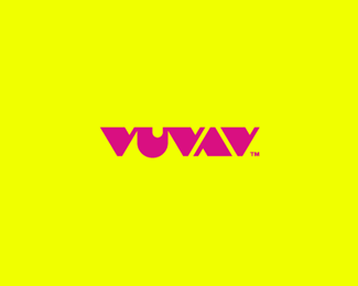
PRIVAX CONCEPT 02
by AlexWende • Uploaded: Mar. 08 '11

Float
(Floaters:
40 )
Description:
**WIP** 2nd Proposal
For a VPN Service (virtual private network) named Privax which helps secure your internet connection + helps protect your online anonymity through encryption. I wanted to symbolize this with a uniqe custom made font
Status:
Unused proposal
Viewed:
6195
Tags:
privax
•
privat
•
v
•
symbol
Share:


Lets Discuss
I would probably make the %22I%22 straight because the %22I%22 and %22V%22 together look like a %22W%22.
ReplyAgree with Jerron. Great start here, bud!
Reply%5E%5E I would have to agree with the pros above me. I read the %22W%22 instead of the %22I%22 and %22V%22 at first. love this direction though. looking strong.
ReplyWhat Jerron, Sean, Mikey said...*Also %22x%22 looks a bit odd.. Maybe try to flip the letter horizontally...
Replyupdatet the %22i%22, it's actually looking more balanced now since there are now 3x vertical and 3x diagonal letters in it :)
Replylookin' good Alex. Just one more thought, is the kerning a tad wide between the %22V%22 and the %22A%22? It could be me, I would wait and see if anyone else thinks so. I only have one good eye, so sometimes these things throw me. :)
Replydid you change the space already, cause I just looked again and now it feels right. man, I need to go. never mind my comment above. :)
Replysorry, yeah I changed it at this moment. I've also done some adjustments between the other letters and some refining on the %22R%22 %26 %22X%22
ReplyStellar!! didnt get to see it before the changes but its great just now!
ReplyThank you java, I think it looks a lot better after the changes were made %3E thx guys! appreciate the fast feedback since this needs to be shown to the client asap %3B)
Replyquite a stunner...:) digs
ReplyNice one, It looks really clean, so I guess you did a good job. %3B)
ReplyThx nitish %26 pierro! I really had fun with the two proposals, glad they got this many positive feedback :D
ReplyNice solution.
ReplyCongrats on the feature!
ReplyREally like this type, I seem to have missed this one completely.
ReplyPlease login/signup to make a comment, registration is easy