drops
by Wizemark • Uploaded: Mar. 03 '11
Description:
wip
As seen on:
www.wizemark.com
Status:
Work in progress
Viewed:
3822
Share:






Lets Discuss
don't know why but this one always gets my attention
Replyevery time :) somehow this is an attention grabbing icon :)
ReplyIt got my attention as well, so I thought I would come add my two cents to the logo design since it is a work-in-progress:
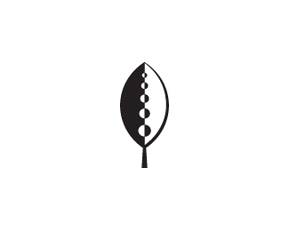
Reply1.) I really like it, but I think some detail would be lost in the circles at a smaller resolution. I believe using only 3 circles would be more effective and be more memorable to viewers. (Remember: humans tend to view things with three elements to be more aesthetically pleasing; the rule of thirds!)
2.) I also think the stem could be a little shorter. When you add text to it (if you're going to, that is) it would sit a little better with a stronger base.
Anyways, I really like it! Can't wait to see the second version! :) If you add color to it, I think a dark green or maybe a natural brown would look really good!
Please login/signup to make a comment, registration is easy