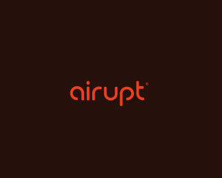
airupt1
by contrast8 • Uploaded: Jan. 03 '11

Float
(Floaters:
36 )
Description:
wip. fully cutom wormark for tech company. need thoughts which you prefeer. thank you. updated thanks for comments
Status:
Client work
Viewed:
4129
Share:


Lets Discuss
This one is really neat, though you might have little problem with I / R, maybe you could try extra line for R, what do you think?
ReplyAgree with milou, I don't like the I R too, but it looks neat in the mass. :)
Replythanks milou, Matto, will change it.
ReplyLike this one, really good type, I see big progress in this way, mate!*
Replythanks Leo:)
Replyflying logo, nice
Replythanks for comments, and floats:)
ReplyNice one mate! The only thing that pops out a bit is that huge empty space between P and T but that would probably be a nightmare to solve (maybe a longer bottom serif of the T letter).
Replythanks Alen:) i thought about this, but didn't find solution how to fix it:)
Replyclient chosen this logo, thanks for help:)
ReplyThat's great Deividas, it looks awesome now.
Replythanks milosz:)
ReplyReally like this alot! :)
ReplyI think this one really rocks. Great type. Spacing needs attention though...
Replythanks:) could agree with that:)
ReplyNeeds more work.
ReplyPlease login/signup to make a comment, registration is easy